 say hi — guilherme@casasantodesign.com
Saúda
A brand that carries Afro Brazilian memory without the word Afro.
- Client
- Agência Statto
- Year
- 2026
- Scope
- Visual identity
- Studio
- Onzza | Estúdio de Design
Saúda is a Brazilian accessories and fashion brand founded by Anderson. It started as Saúda Afro at independent fairs and samba rock events, selling pieces that carry memory, self-esteem and belonging.
The brand outgrew its old identity, which had gone years without an update. The challenge was to build a broader, more mature and more sophisticated visual universe, one that keeps memory and affection but avoids literal or predictable codes.
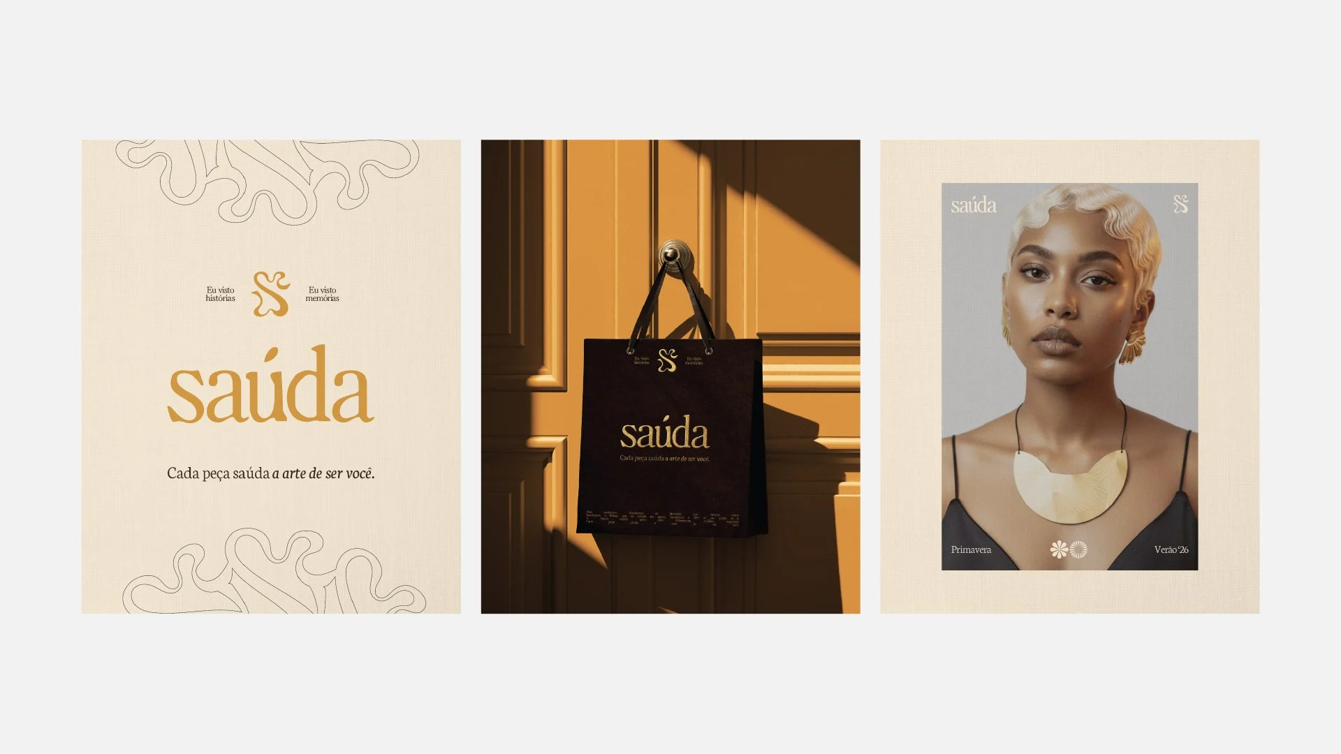
Strategy and naming came from Statto, with the proposition "Nós saudamos" and the signature "Cada peça saúda a arte de ser você". The word "Afro" left the name so the roots could be felt in each piece instead of stated. Onzza developed the visual system from Concept 01 of the brandbook: a structured base combined with organic, gestural elements.
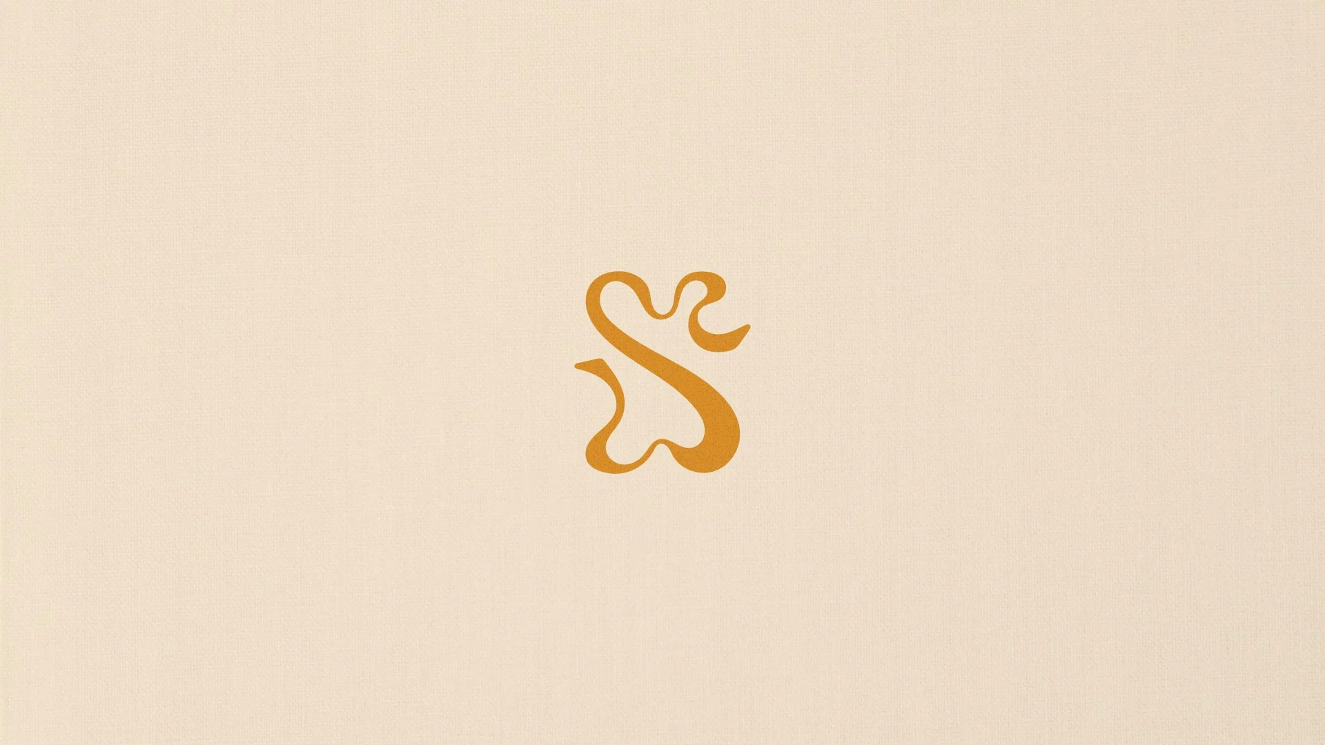
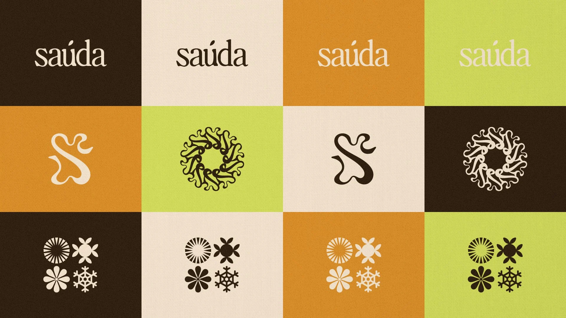
The contrast between an elegant serif and a hand-drawn S carries that idea. Warm colors hold the system together, and one lime green breaks it on purpose.
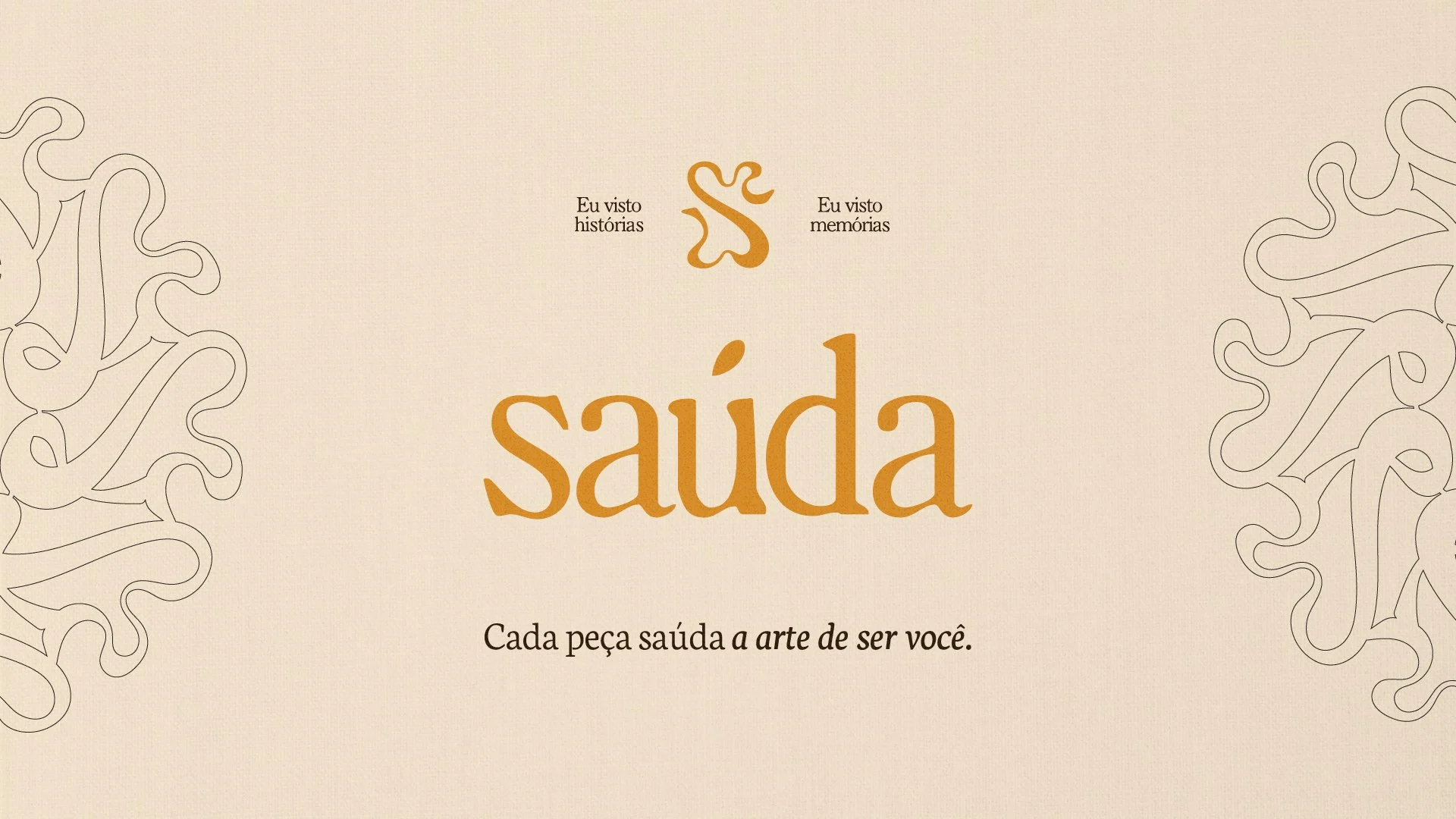
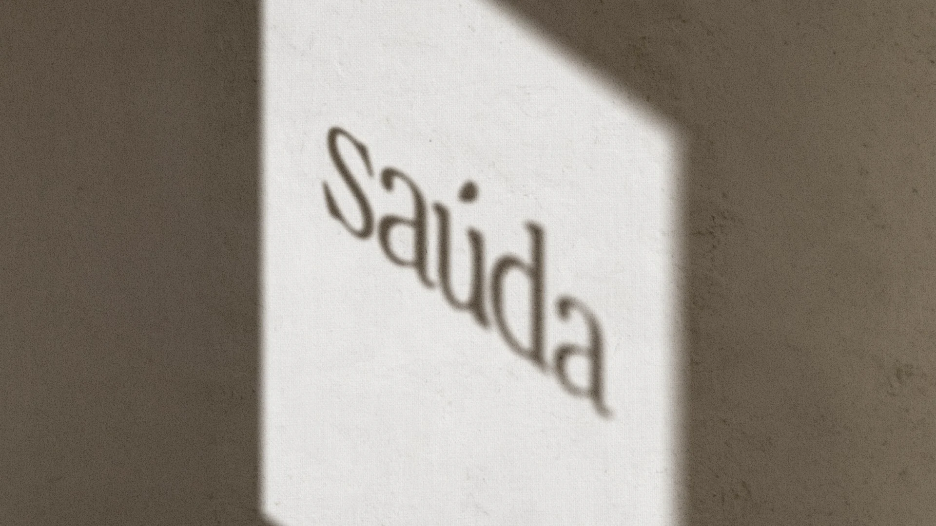
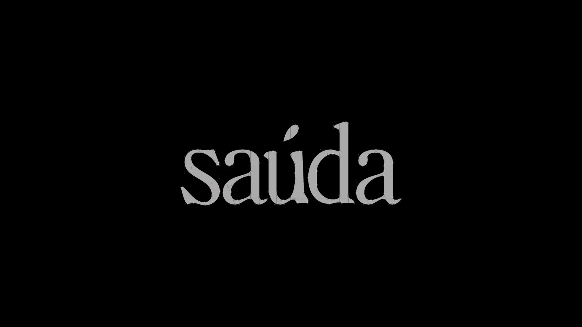
The logotype is the word "saúda" in lowercase, drawn with organic shapes and elegant proportions. Lowercase and a serif with presence were both requests from the client during the reference phase, and the construction avoids conventional solutions.
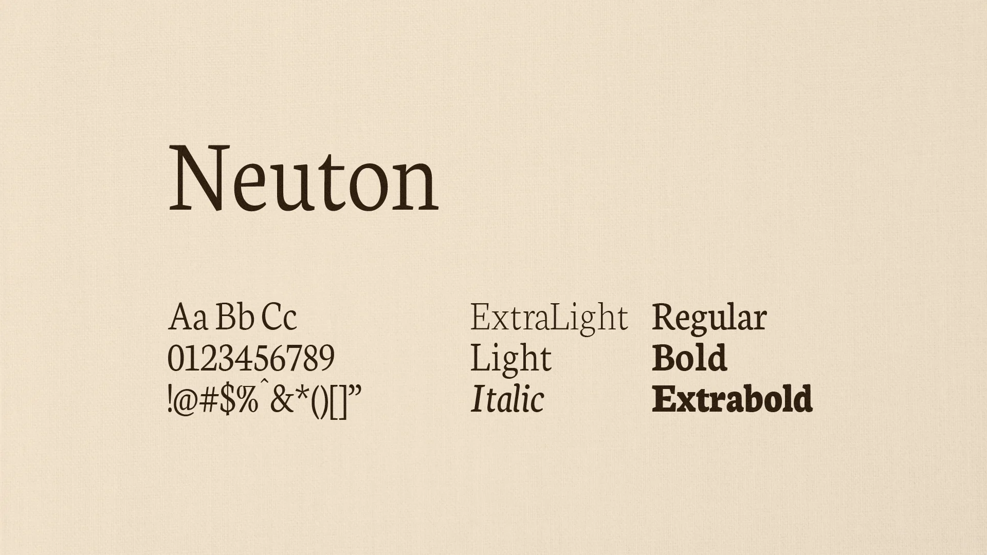
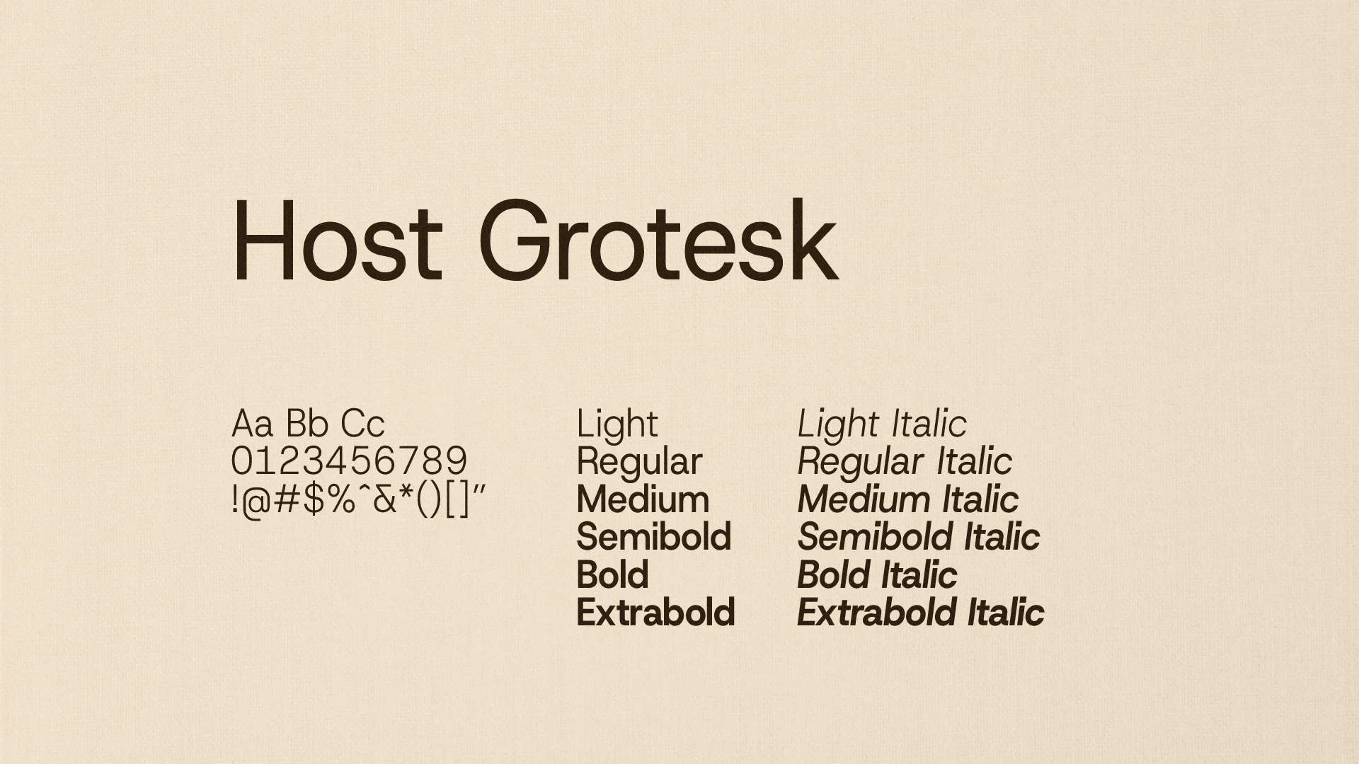
Neuton, a serif, handles the logo and highlights, from ExtraLight to Extrabold. Host Grotesk supports it with a neutral, readable voice in six weights plus italics.
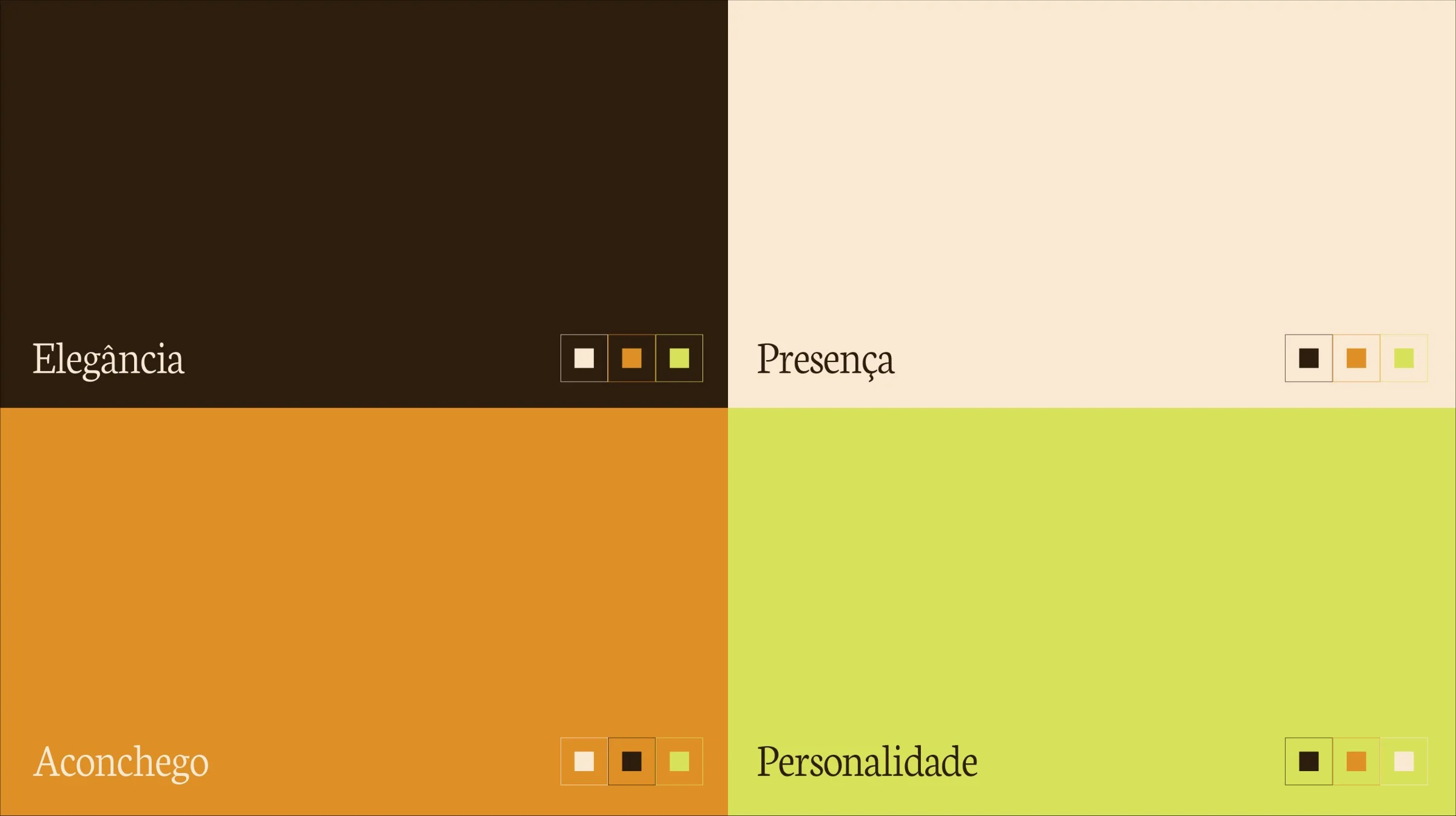
Four colors build the palette: a very dark brown, a sand beige, a mustard orange and a lime green. They are tied to four words: Elegância, Presença, Aconchego and Personalidade. Brown gives the base depth, orange adds warmth, and the lime green appears as the point of rupture.
The choice follows the client's own feedback, which asked for dark brown, orange and a light green tied to Brazilian identity, and ruled out blue, gray and pastel backgrounds.
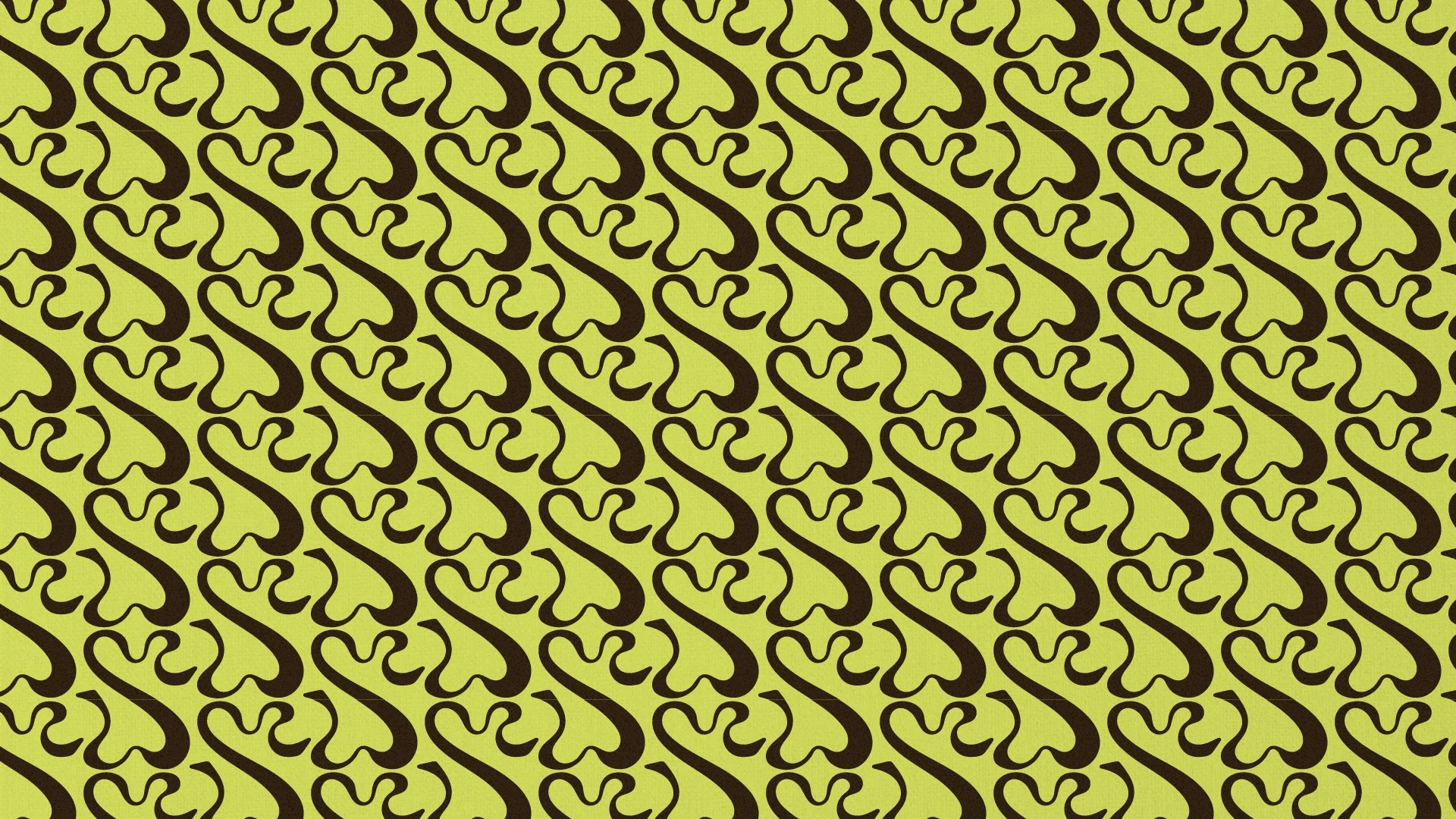
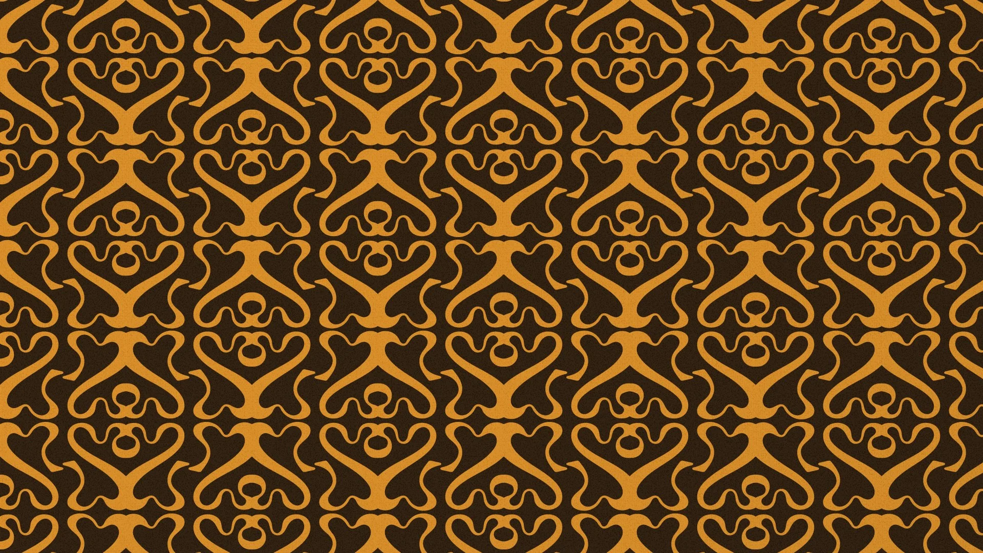
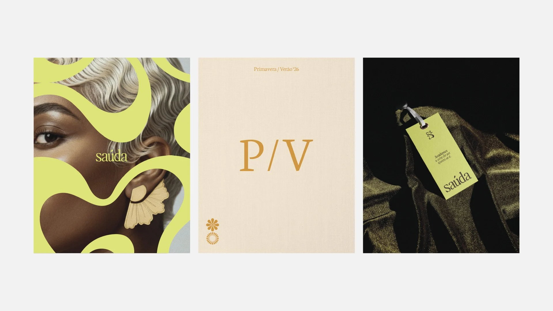
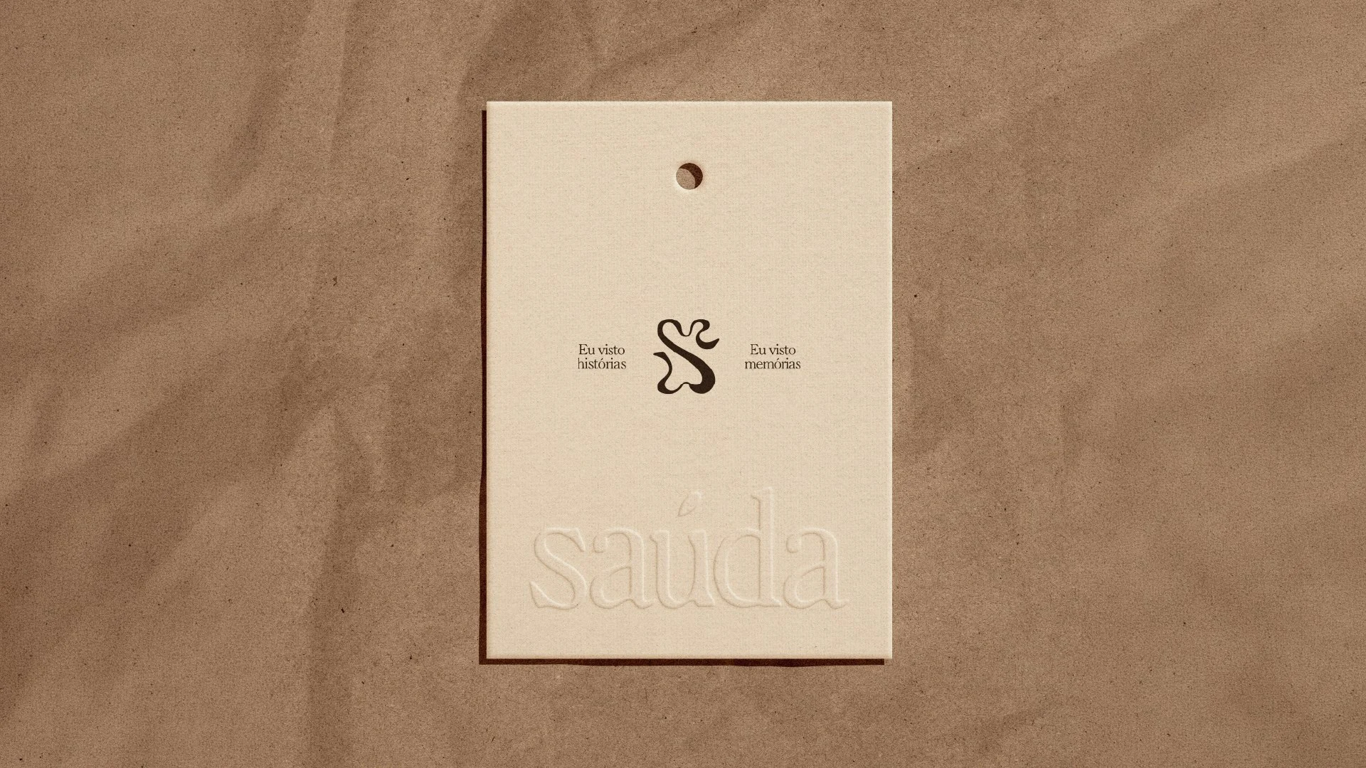
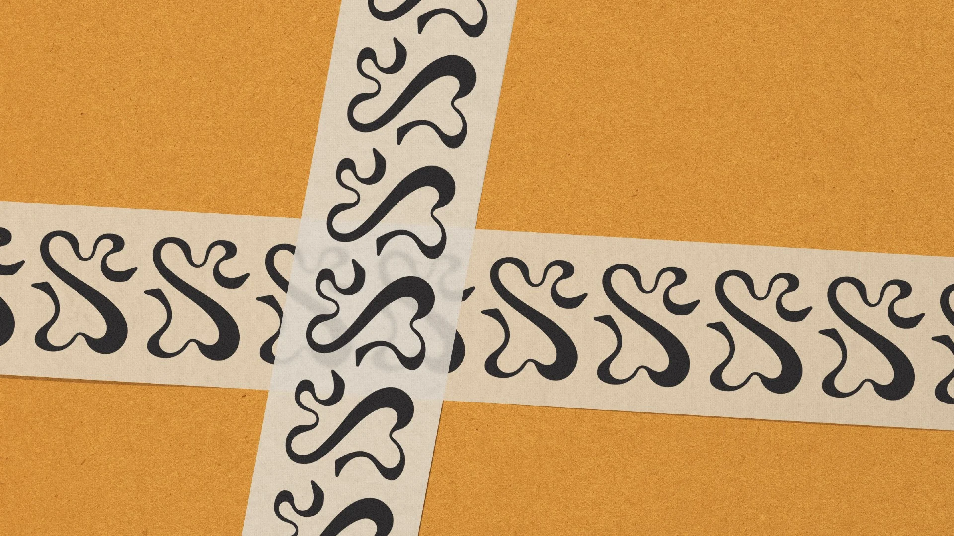
The hand-drawn S works as symbol and as graphic resource. It can be enlarged, repeated, cropped and applied over surfaces and images. Repeated diagonally, it becomes a lime and brown pattern. Mirrored in symmetry, it becomes a brown and orange one.
A second system of icons, in rosette and floral versions, draws on the four seasons and is meant to follow the collections.
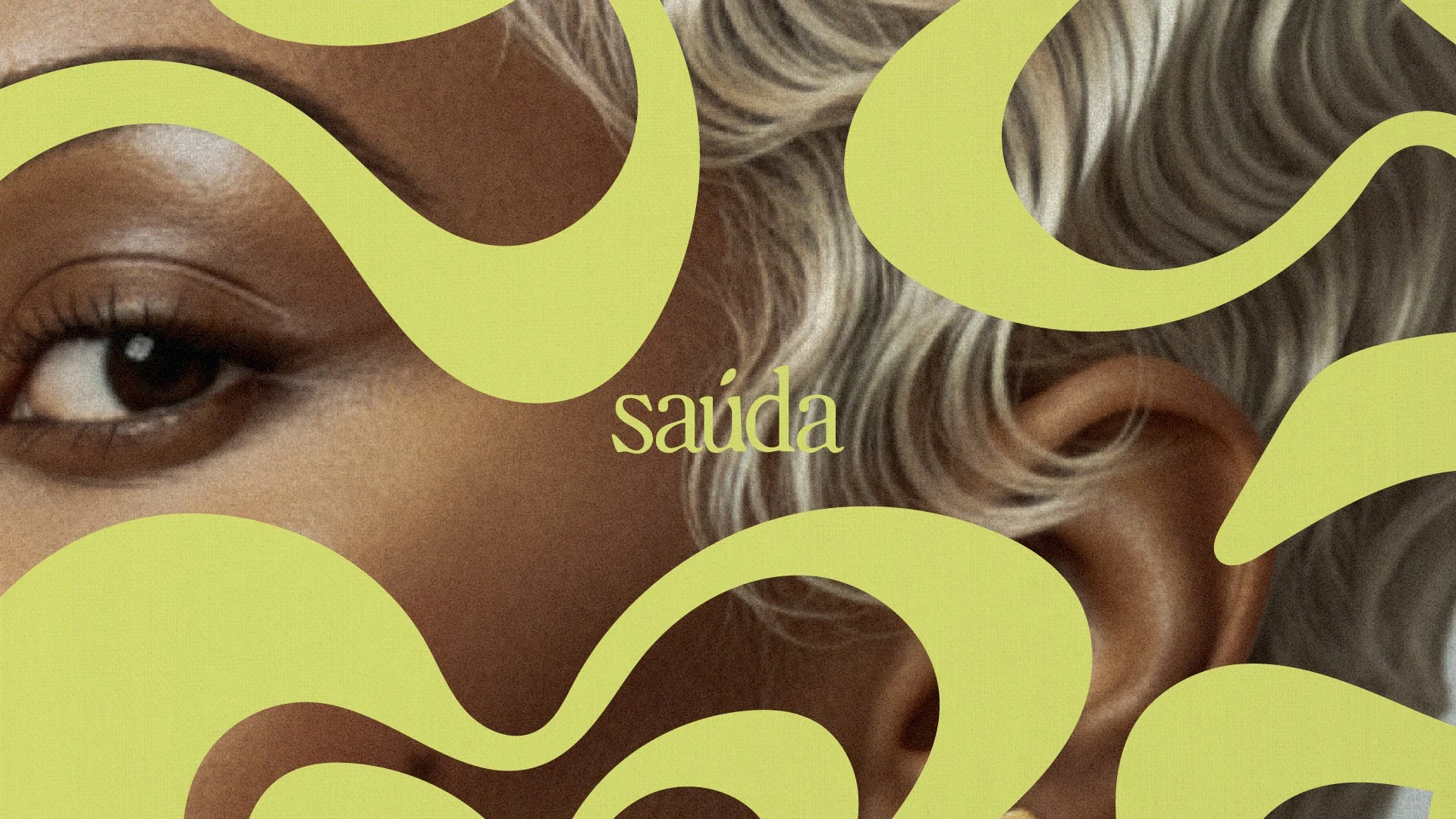
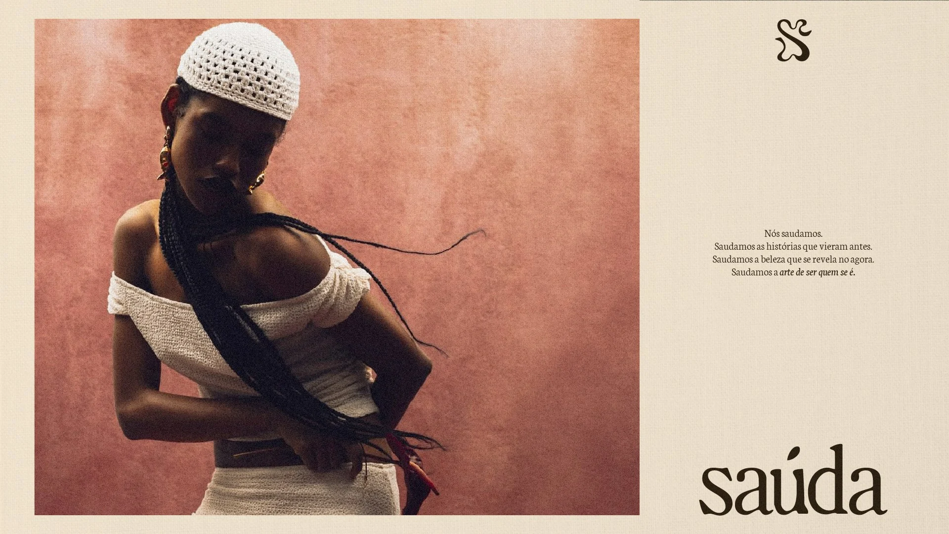
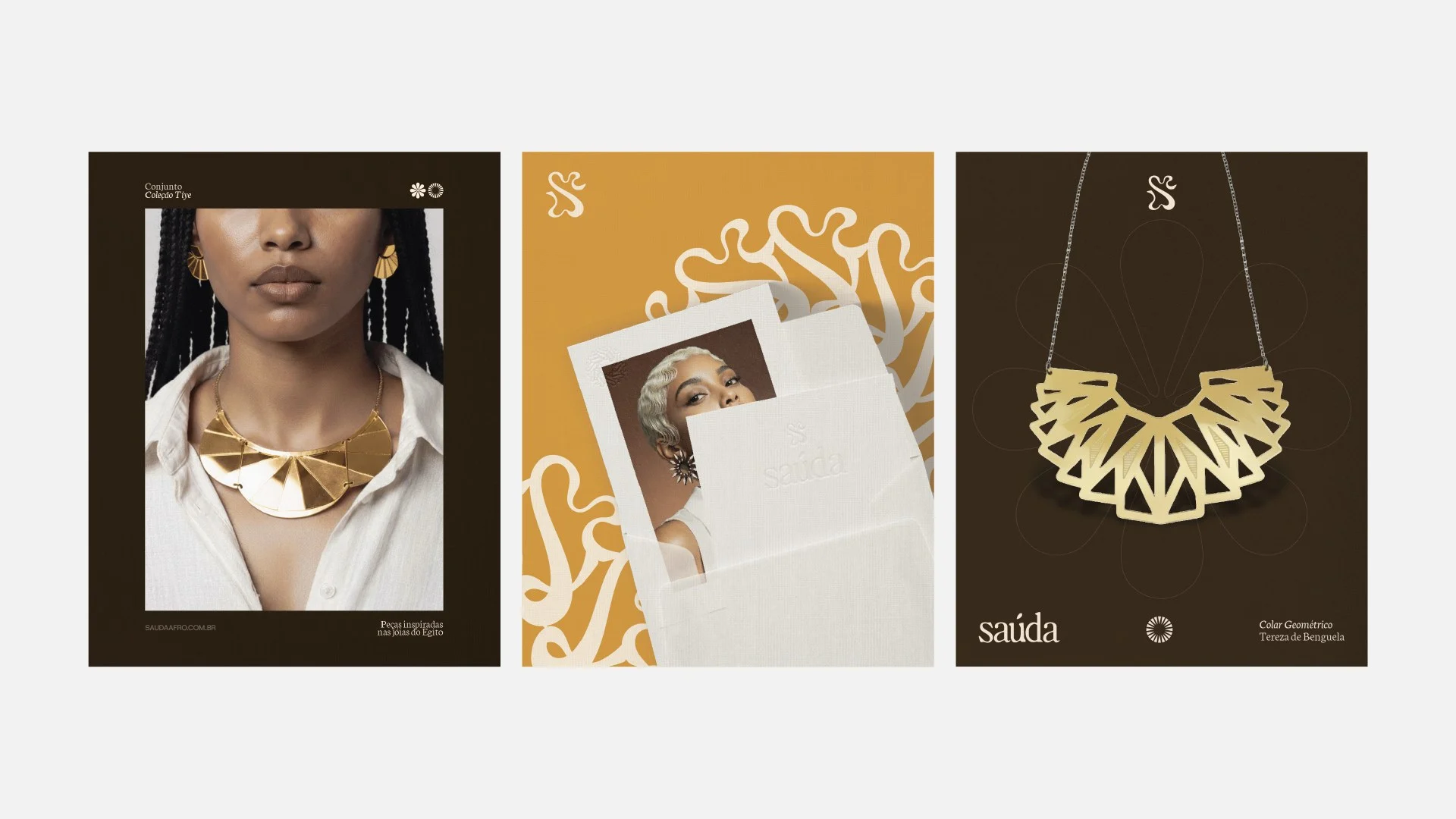
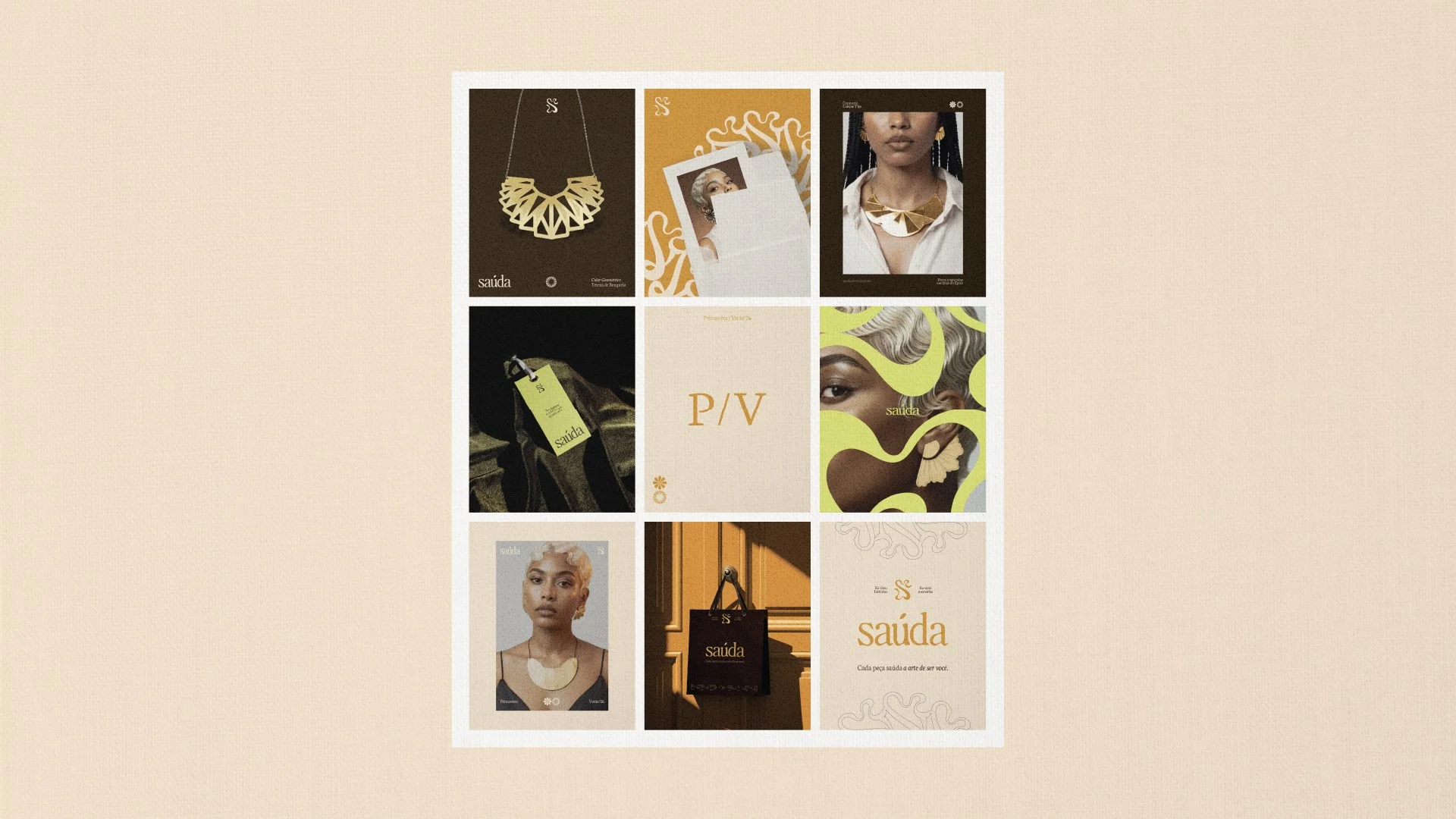
The photographic direction is editorial, with cropping and overlays. The images are portraits of Black women wearing statement jewelry, shot in studio light against warm backgrounds such as terracotta.
On top of the photography, lime green waves cut across the frame and the face, so the symbol's gesture also works as a layer over the image.
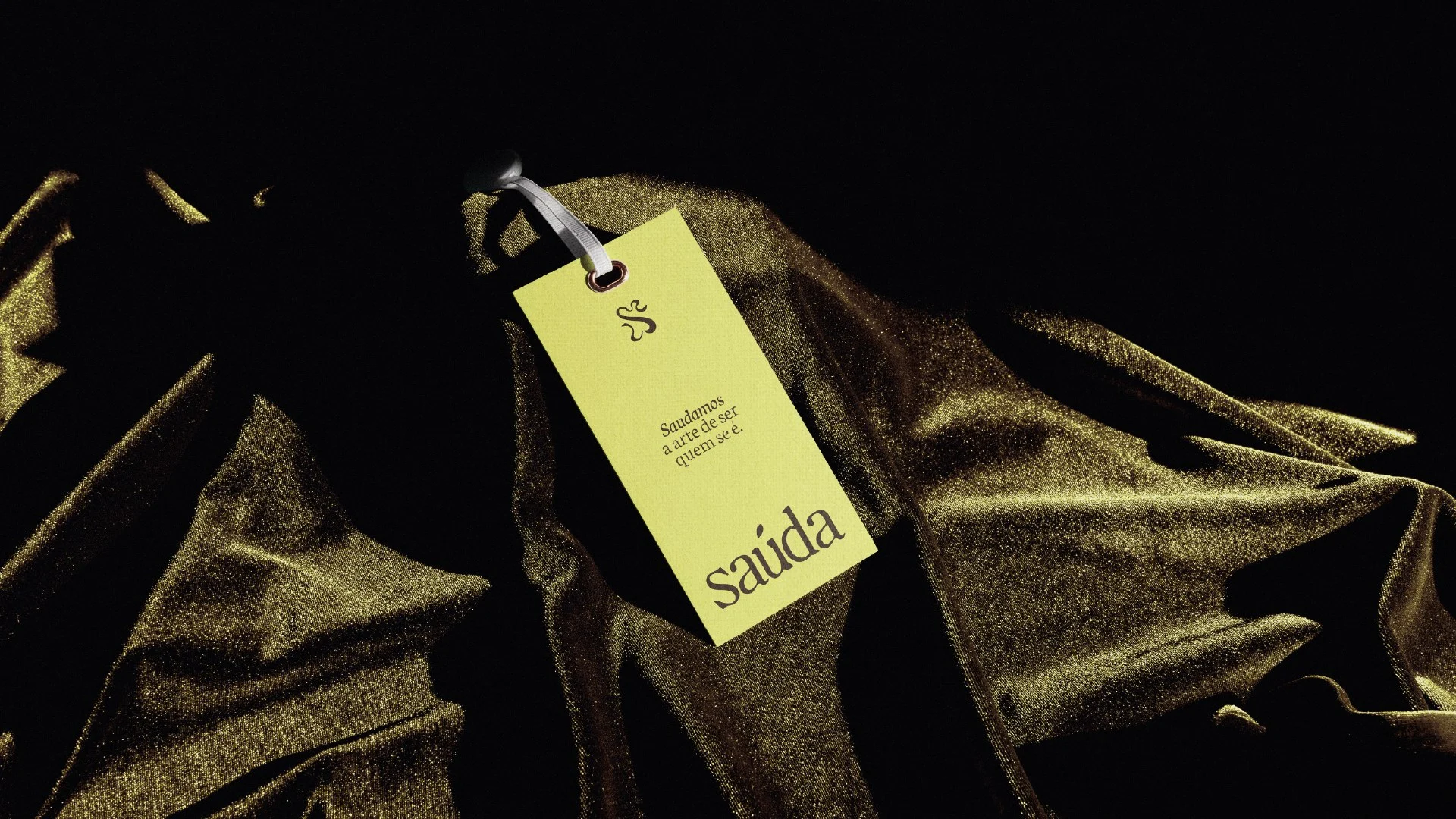
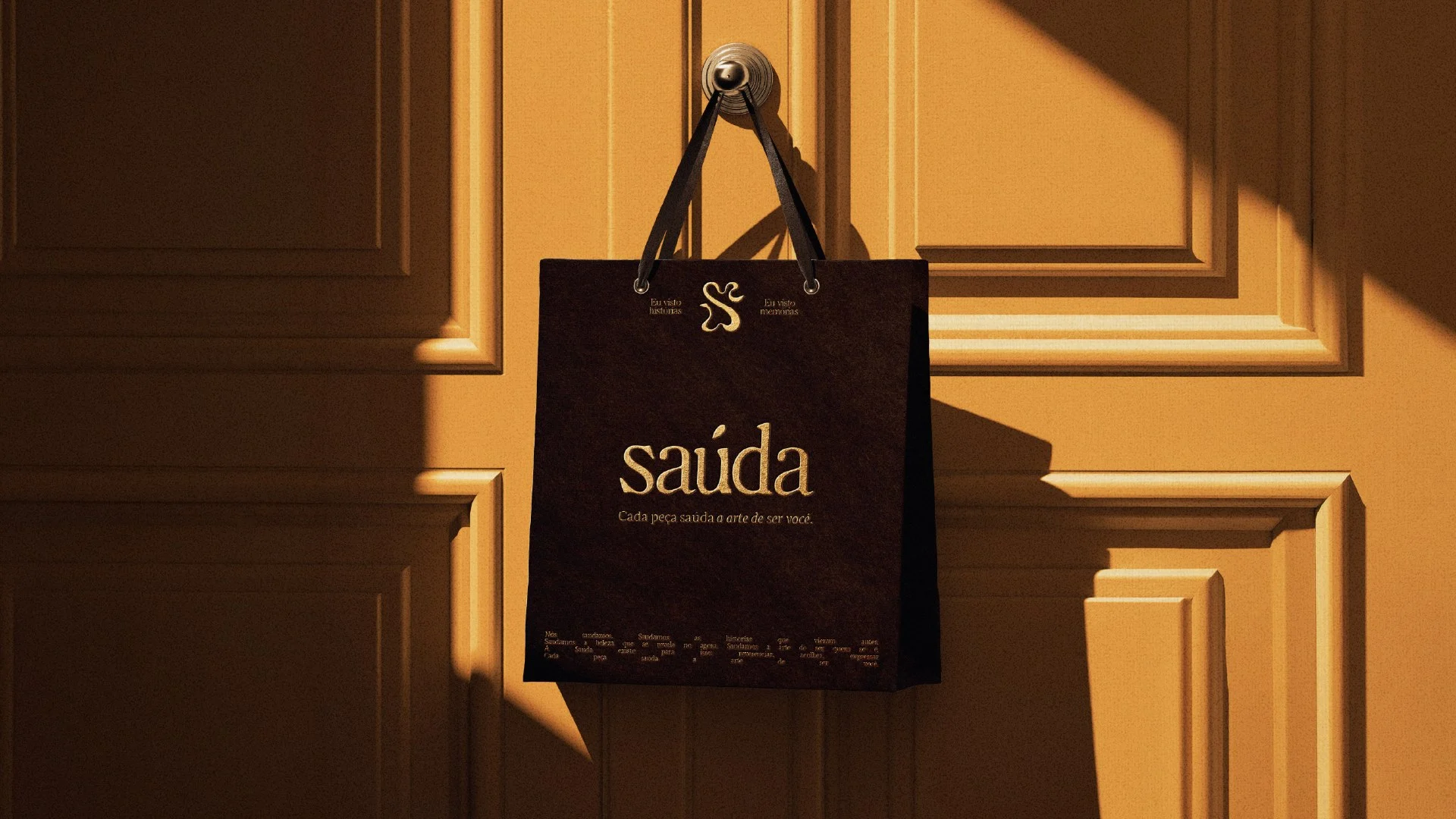
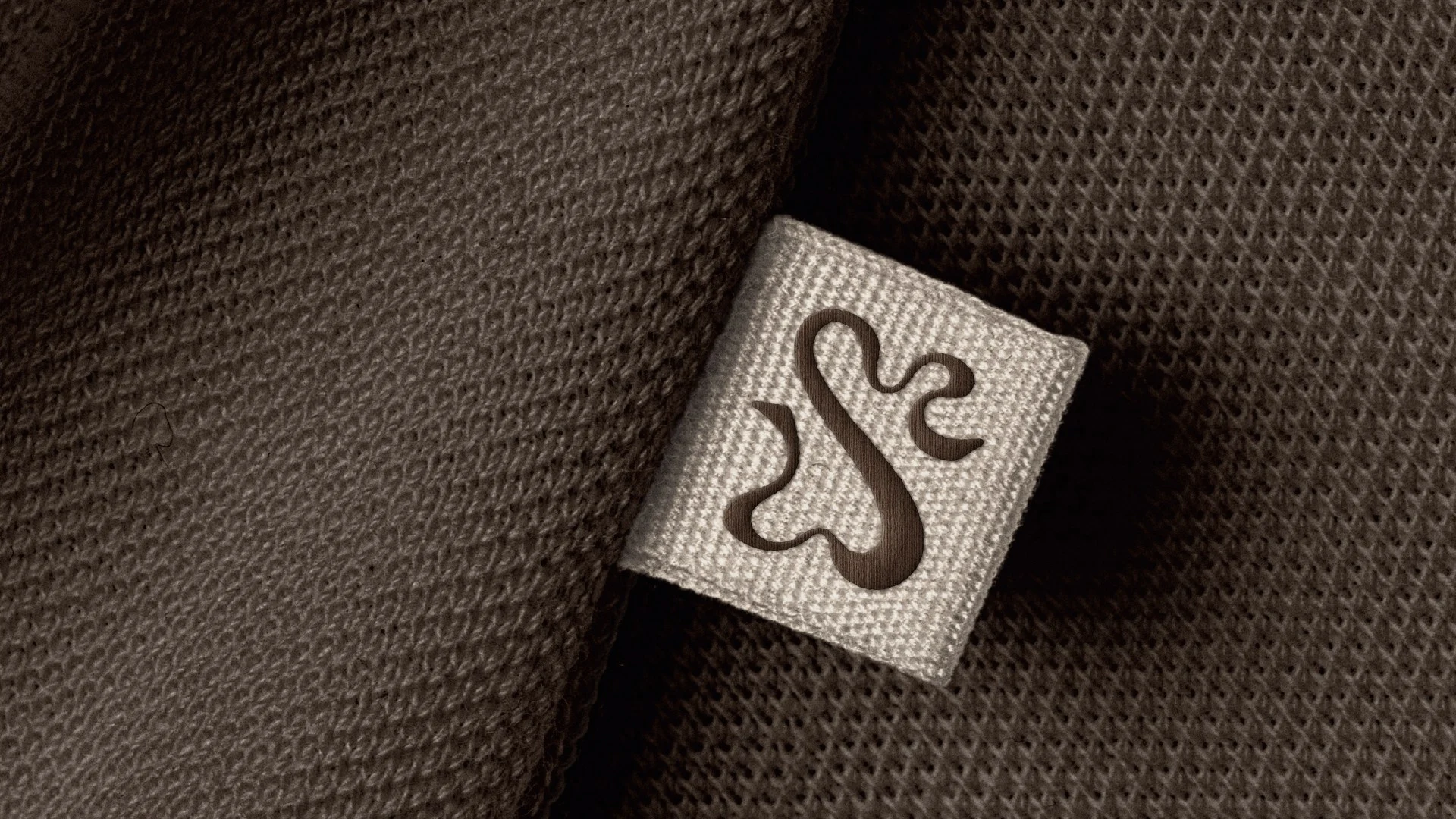
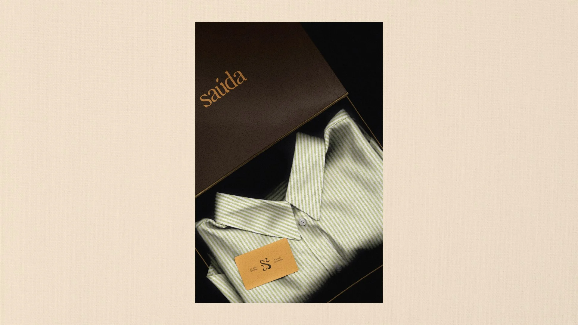
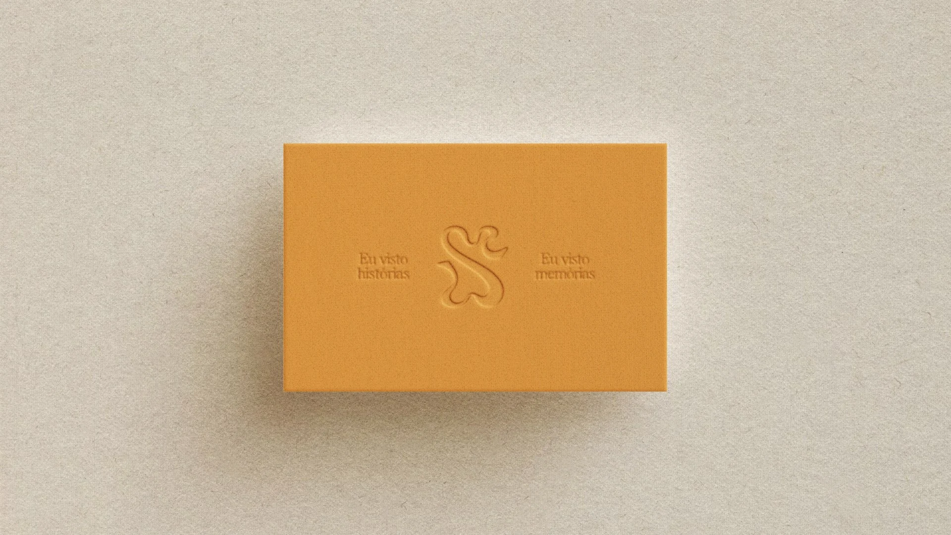
The system was tested across touchpoints: a brown shopping bag on an orange door, lime and beige tags, a textile label with the S in relief, packaging tape with the symbol repeated in a continuous line, an orange business card with blind emboss, and a box holding a shirt.
The posters bring jewelry, portraits, patterns and the P/V code together, which suggests how the seasonal collections can be organized.
The new identity gives Saúda a language of its own, with a proprietary symbol, a distinctive serif and a palette that avoids the expected. It lets the brand present itself as mature and editorial while keeping affection at the center.
The system is built to grow with new collections, products and narratives.

Project created in 2026 at Onzza | Estúdio de Design.
Brand strategy and branding: Stéphani Souza @ Statto
Copywriting: Stéphani Souza @ Statto
Creative Direction: Guilherme Casasanto and Marianna Muller @ Onzza
Art Direction: Guilherme Casasanto
Graphic Design: Guilherme Casasanto
Todos os direitos são de propriedade da Statto Brands e Saúda Afro and Co.