 say hi — guilherme@casasantodesign.com
Chácata Sentinela
A visual identity for the art of celebrating the moment.
- Client
- Chácara Sentinela
- Year
- 2026
- Scope
- Visual identity
- Studio
- Onzza | Estúdio de Design
Chácara Sentinela is a rural property near Curitiba, founded in 2019, that rents its grounds for weddings, events and high-end photo shoots. It has a bride's house, a hall and a lakeside deck, with capacity for up to 180 guests.
The brief asked for an identity that joins institutional authority and sensory warmth. The name carries the rigor of a guardian, and the service carries the affection of a family. The brand had to hold both.
The central idea is the tree as a sentinel: a symbol that protects and welcomes. "Sentinela" points to a keeper of rituals and memories, and the tree gives that role a shape that belongs to the landscape.
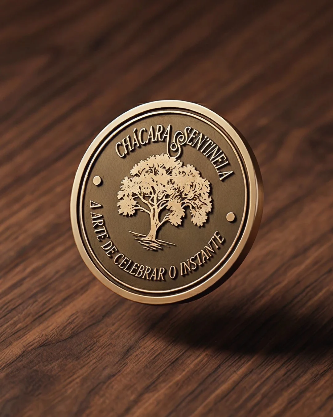
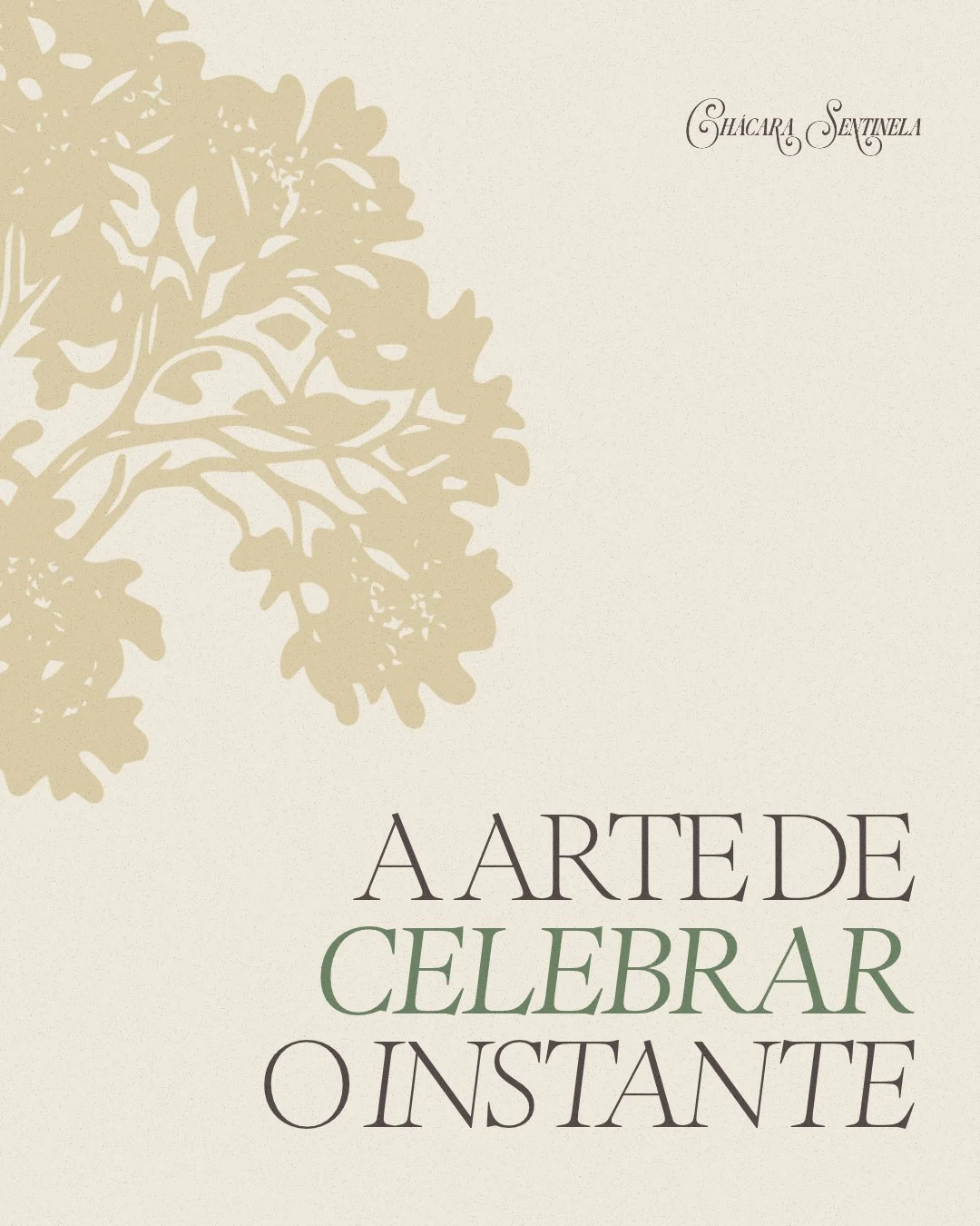
The slogan from the brand manual, "a arte de celebrar o instante", became the signature of the system. Campaign lines such as "Onde a natureza encontra o amor" keep the tone short and affectionate.
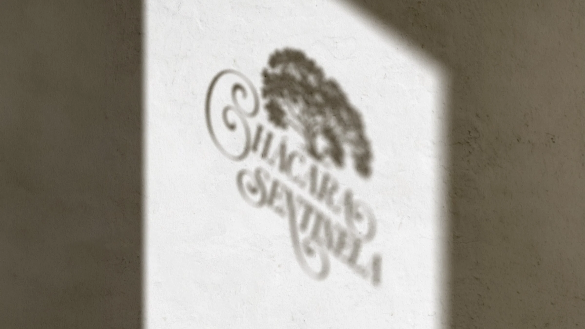
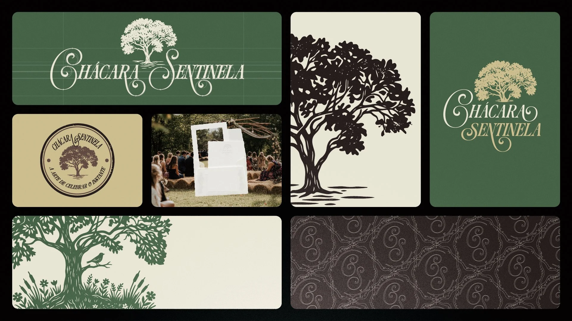
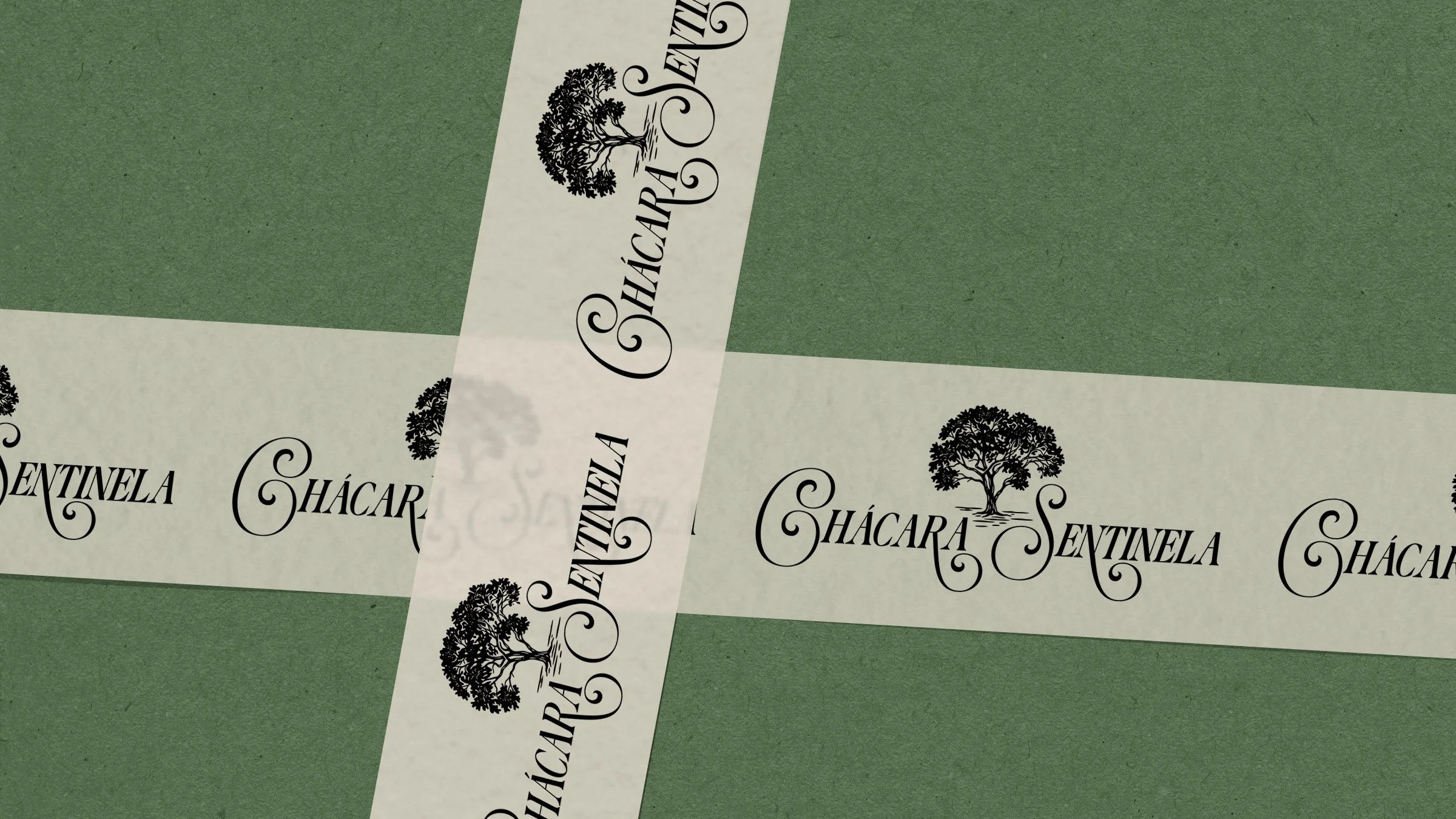
The logotype is calligraphic, with swashes that bring warmth to a name that could otherwise read as military. The manual sets Aman Headline for titles and for the logo, and Aman Text for text.
In campaign pieces, a light serif in upper and lower case carries the phrases. The contrast between ornamented script and quiet serif keeps the formal side readable and the emotional side visible.
The palette combines deep moss green, sand gold (#D6C69D) and light beige (#ECE7D8), supported by two browns, #3F3332 and #7A5D52. Green works as the main background, with gold and beige as contrast.
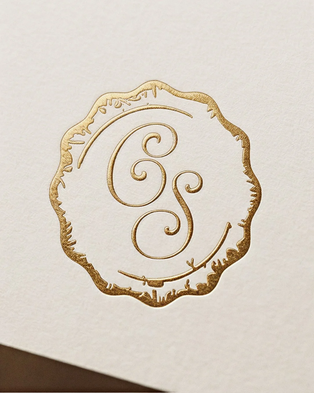
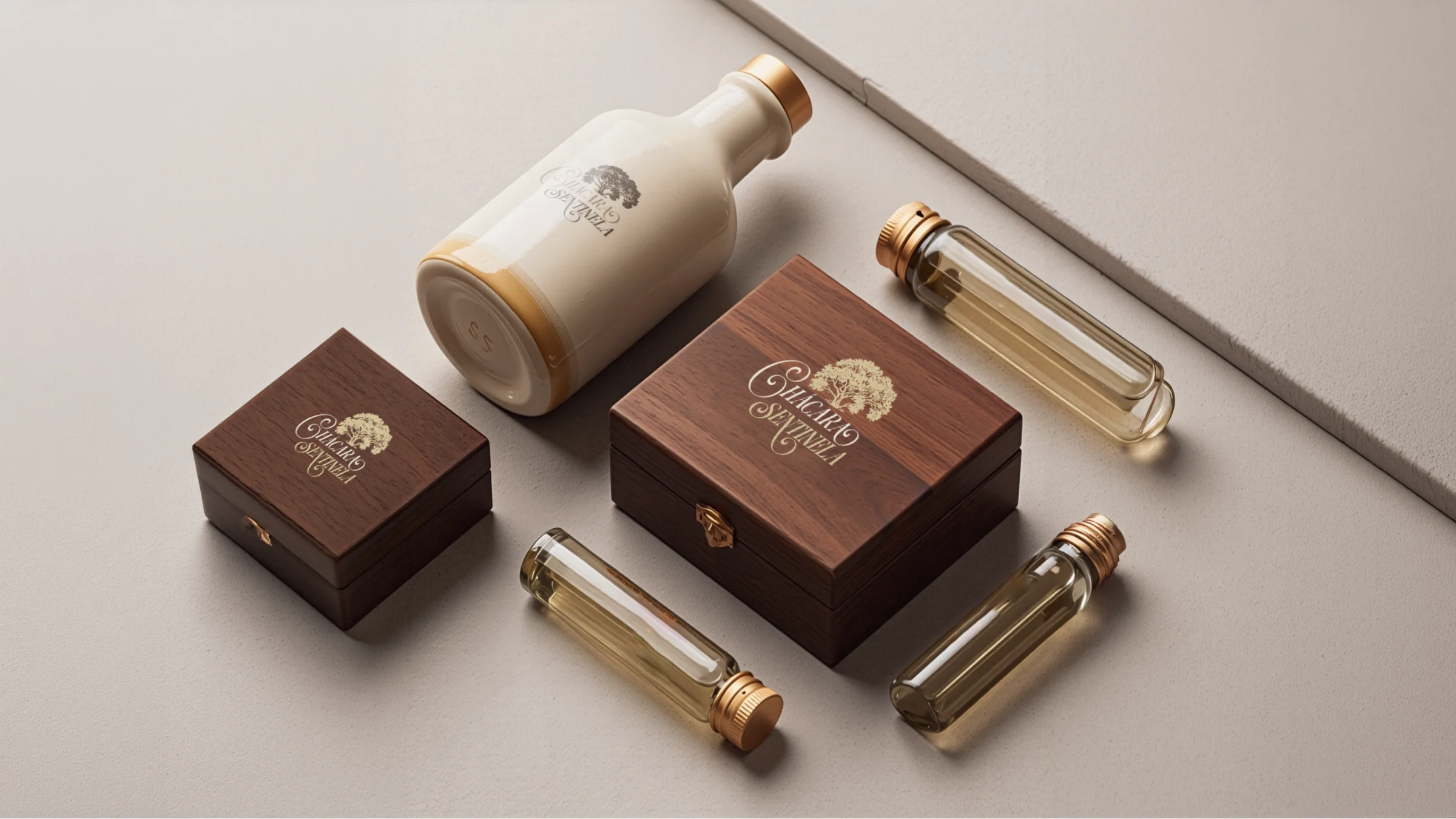
The choice follows the setting: earth, foliage and warm light. Gold is reserved for details such as hot stamping, so it reads as finish and not as noise.
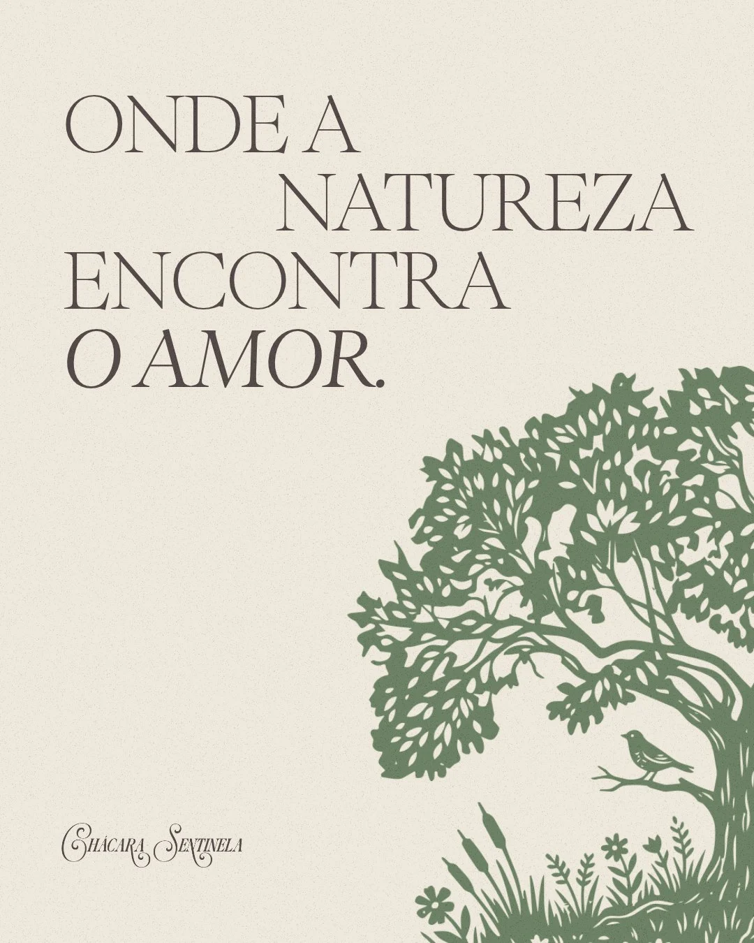
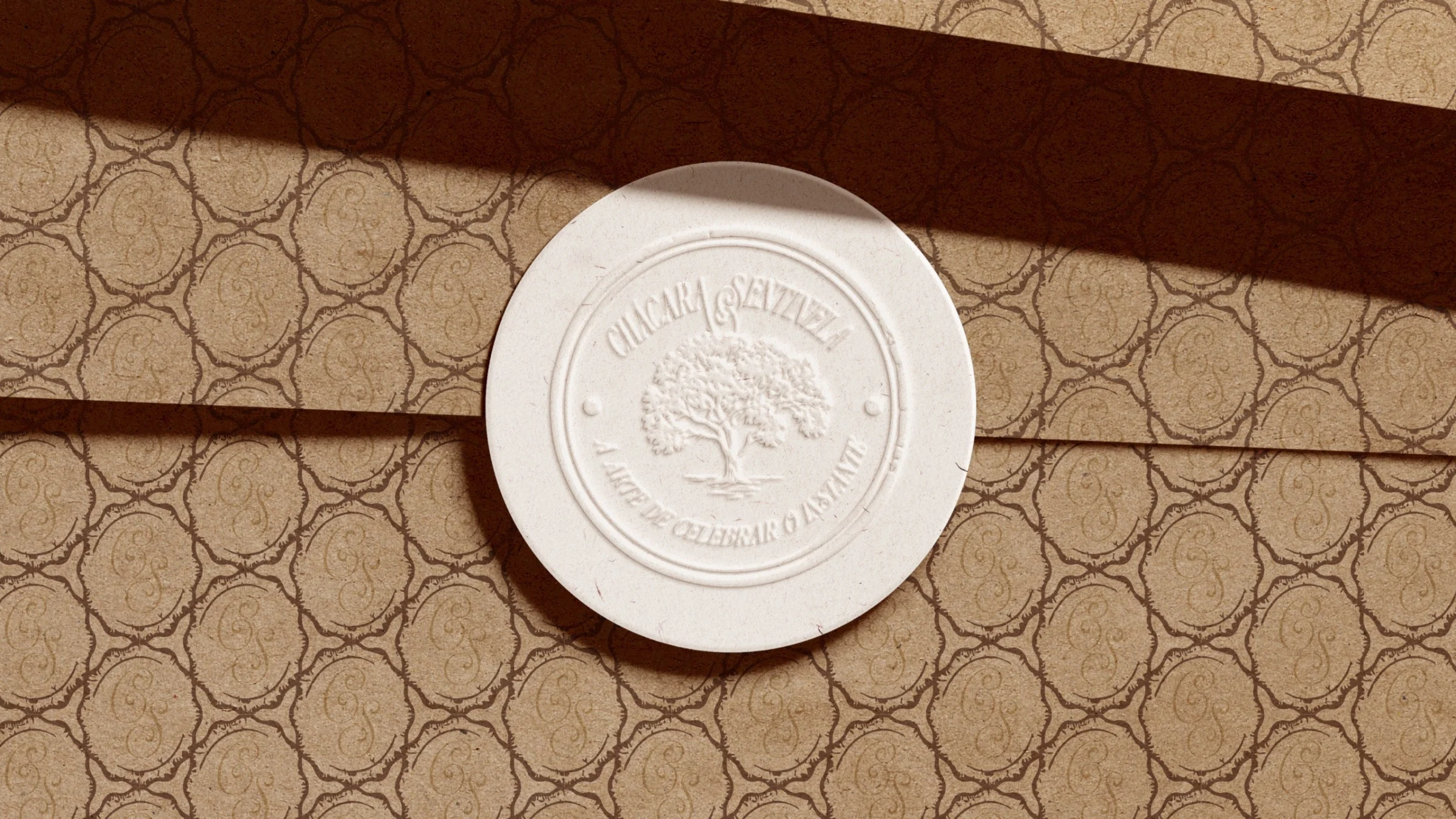
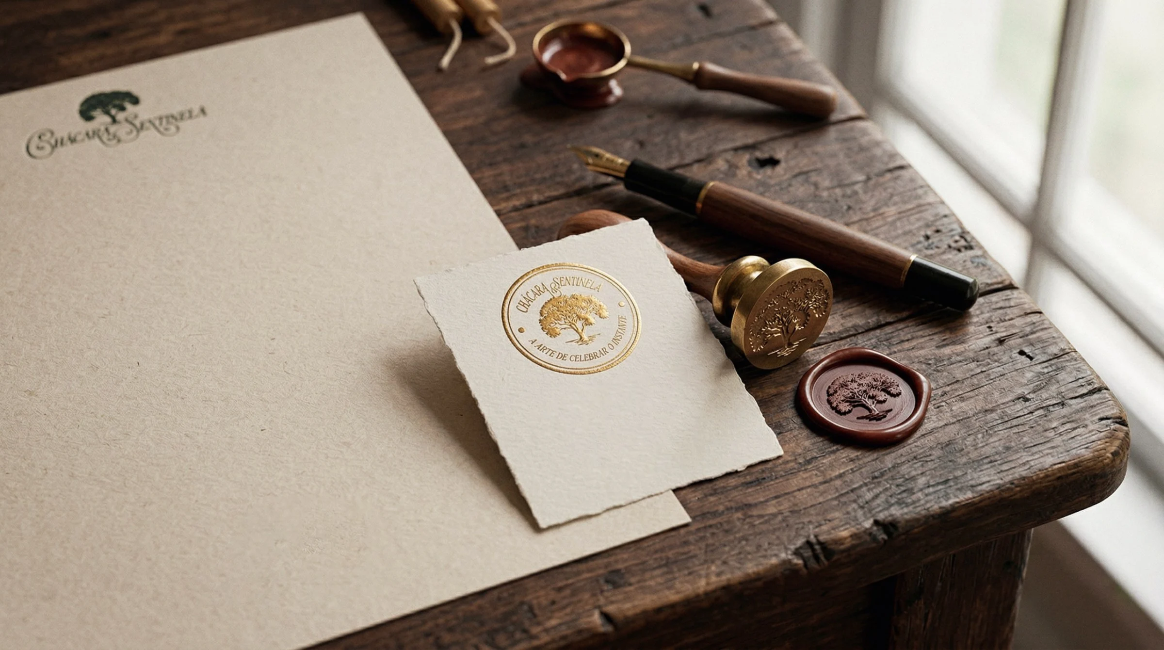
The symbol is a broad-canopy tree, drawn in line, in silhouette and in embroidery. The emblem is a wavy seal with a CS monogram, built for hot stamping and wax.
An official pattern of interlaced circles covers envelopes and surfaces. Line illustrations of trees, foliage and a bird extend the symbol into editorial layouts with generous empty space.
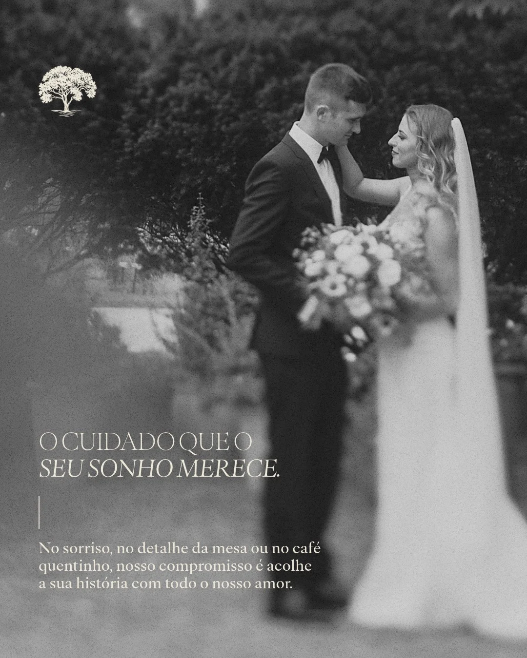
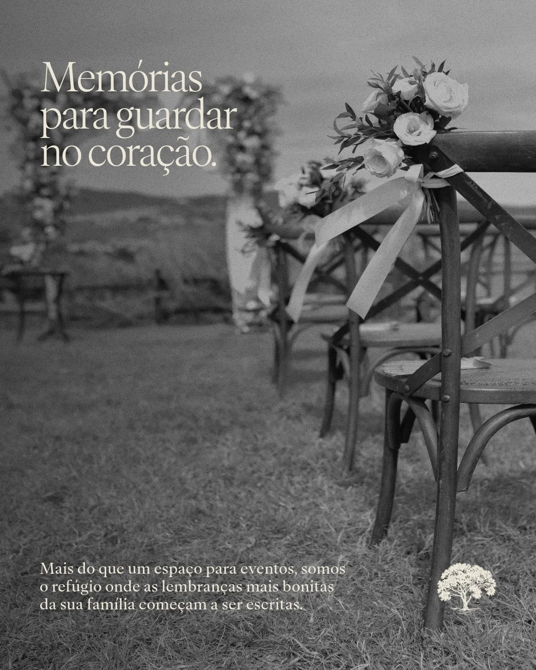
The brand manual asks for warm, earthy tones, wood, stone and linen textures, clean framing and natural late-afternoon light. The feed follows it by alternating black and white couple photos with short serif captions.
Grayscale lets the couples carry the emotion while the logo and the tree stay the only brand marks. Phrases like "Memórias para guardar no coração" sit in the empty areas of each frame.
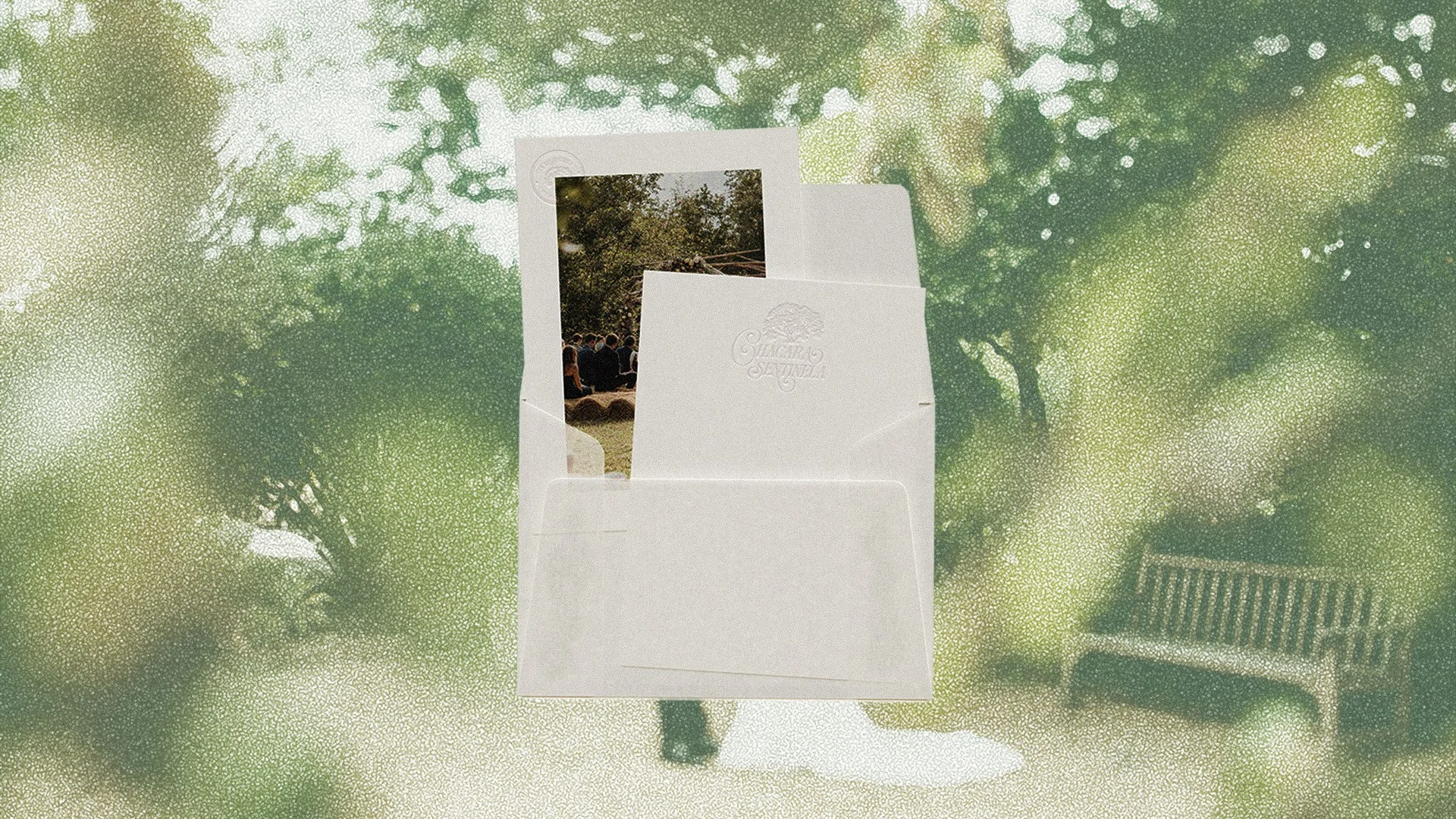
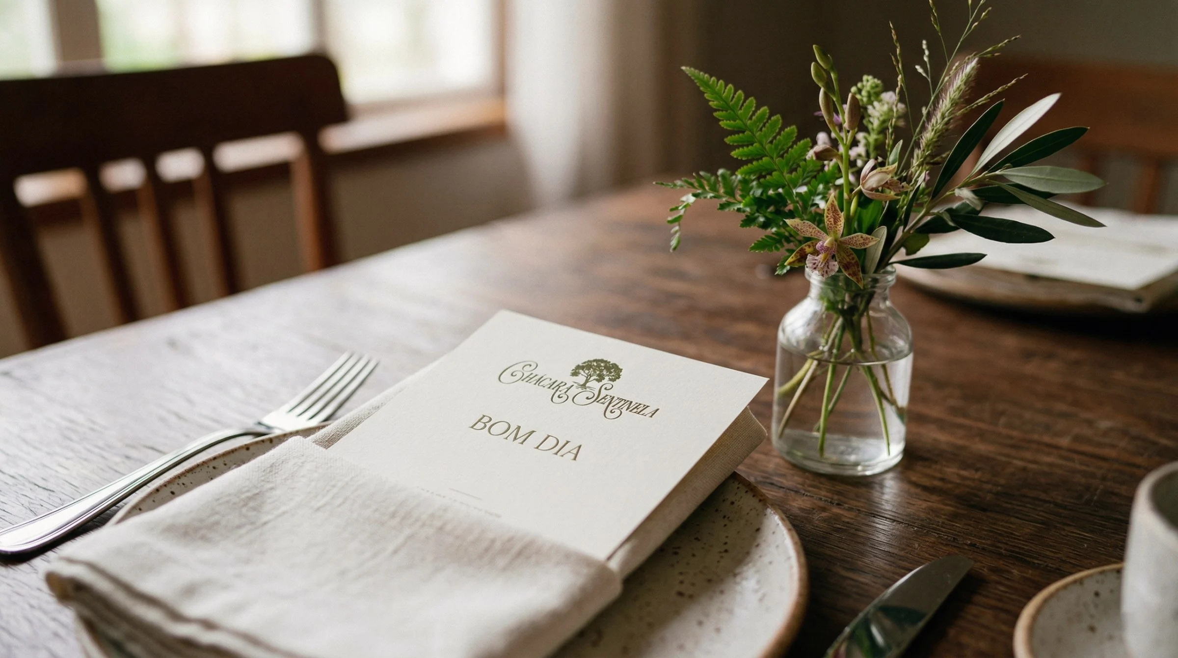
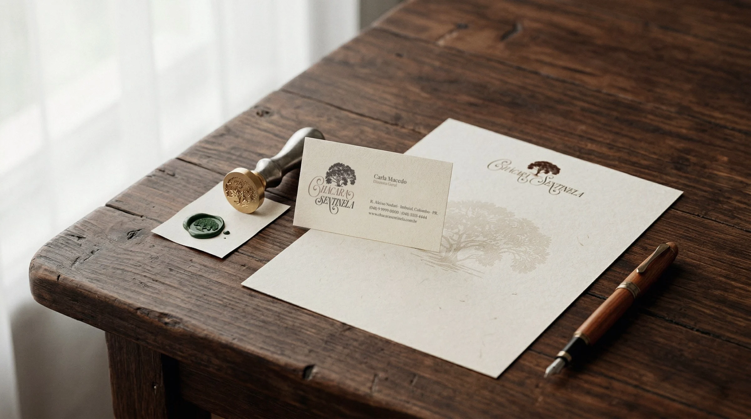
The system extends to the physical touchpoints of an event: stationery with wax seal, menu on the table, branded tape, a gift kit with wooden box, bottle and vials, and an embroidered apron for the team.
Each piece uses dark wood, cotton paper or green cloth as a base, which repeats the textures the manual asks for. The mark changes scale and technique, from embroidery to embossing, without changing its structure.
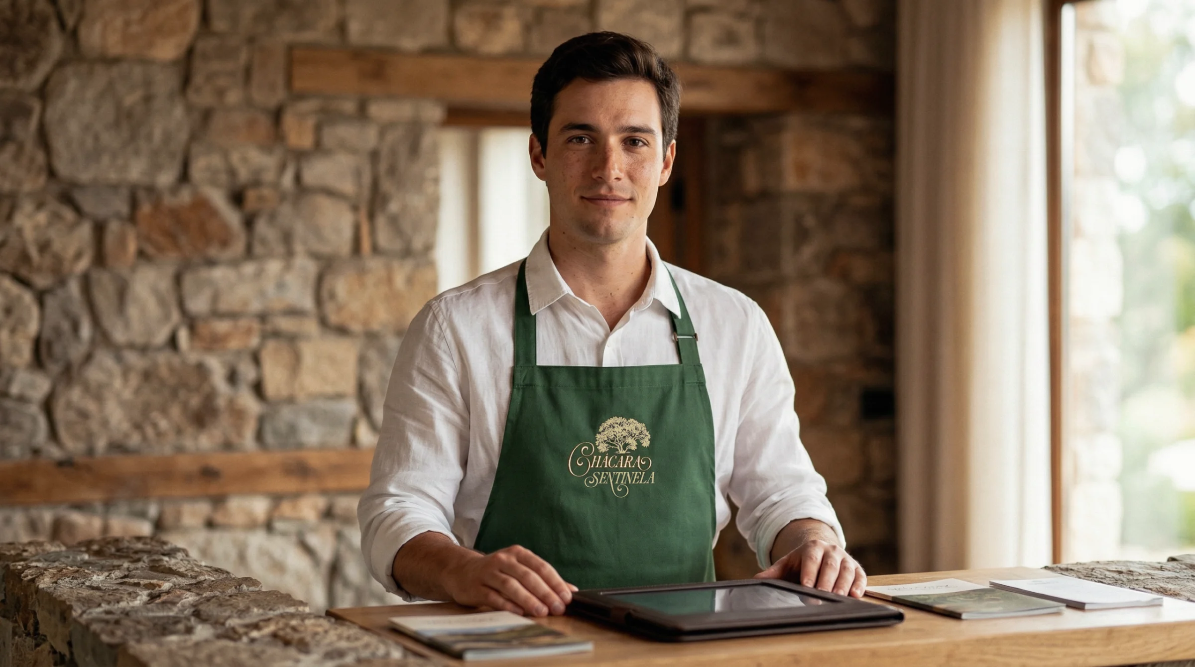
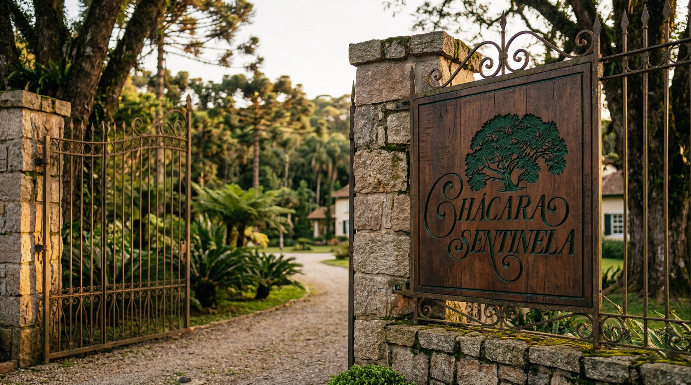
The identity gives Chácara Sentinela a clear voice for two audiences at once: brides who look for warmth, and families who look for security. The tree, the script and the green and gold palette work together as one recognizable system, from the entrance sign to the feed.
Project created in 2026 at Onzza | Estúdio de Design.
Brand strategy and branding: Marianna Muller
Copywriting: Marianna Muller
Creative Direction: Guilherme Casasanto and Marianna Muller
Art Direction: Guilherme Casasanto
Graphic Design: Guilherme Casasanto
Todos os direitos são de propriedade da Chácara Sentinela.