 say hi — guilherme@casasantodesign.com
Fachini Art Studio
A quiet identity for an art studio built on looking.
- Client
- Maria Cleusa Fachini
- Year
- 2025
- Scope
- Visual identity
- Studio
- Casasanto Design
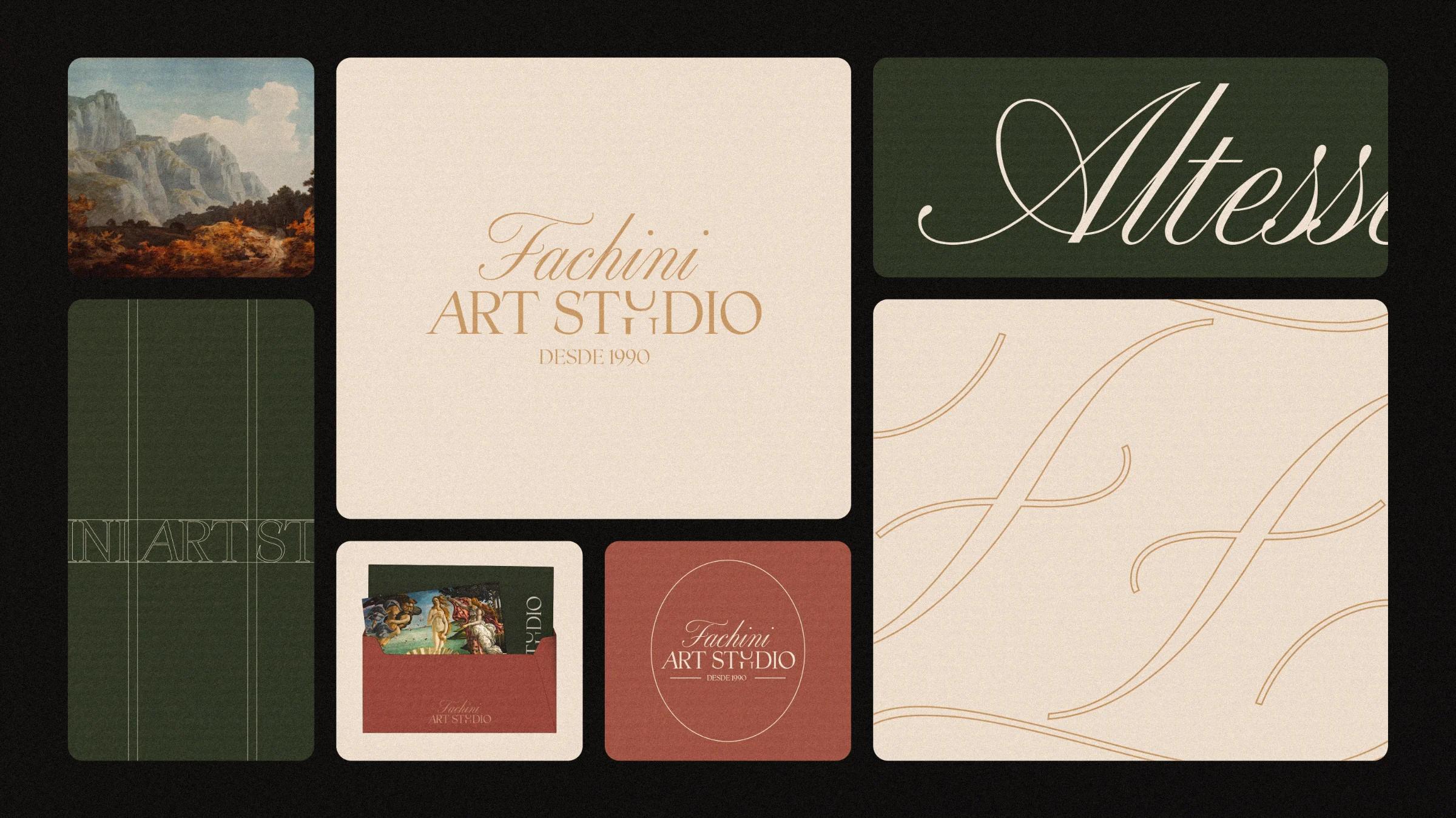
Fachini Art Studio is an art studio founded by Maria Cleusa, dedicated to creation, expression and the development of a sensitive eye. The brief was to give a space that joins learning, experimentation and contemplation an identity that could be read as a gallery and still feel close to its students and clients.
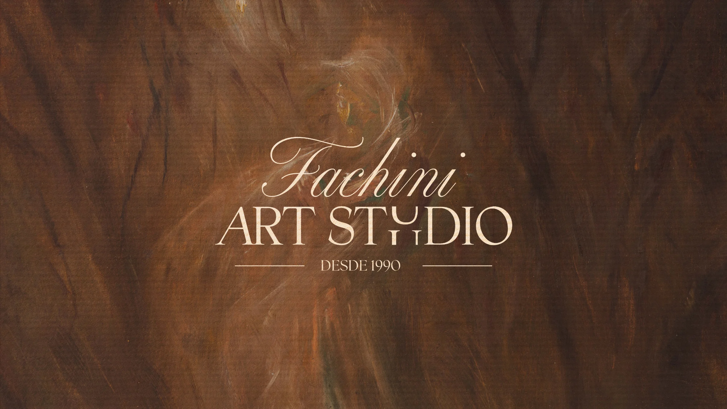
The brand starts from the meeting of sensitivity and thought, and rests on three attributes: feminine, elegant and intellectual. The studio sees art as a quiet force, so the identity whispers instead of shouting. Restraint became the main design decision: few elements, generous space and no ornament without a reason.

Three families share the work. Melodrama brings sharp edges and emotional weight. Altesse Std, a fluid script, signs the name Fachini and gives the brand its most intimate voice. Host Grotesk organizes reading in titles, subtitles and body text, so the expressive faces never compete with information.
The palette is earthy and built on five tonal families: Névoa, Tecido de Linho, Âmbar Doce, Terra de Siena and Granada. In use, the system relies on strong contrast between burgundy, beige and black. Olive green appears in some pieces as a counterpoint to the warm tones.
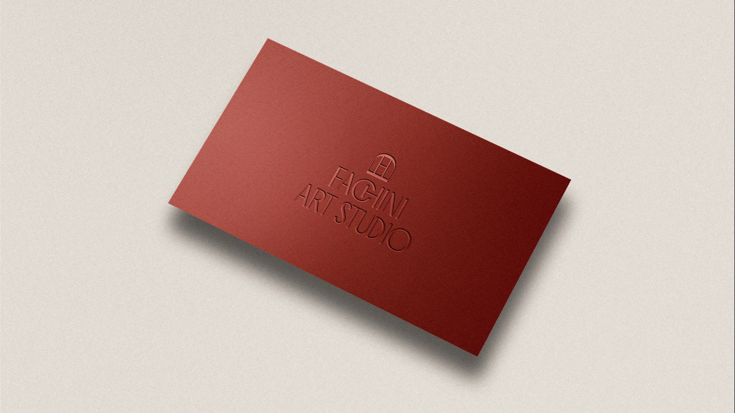
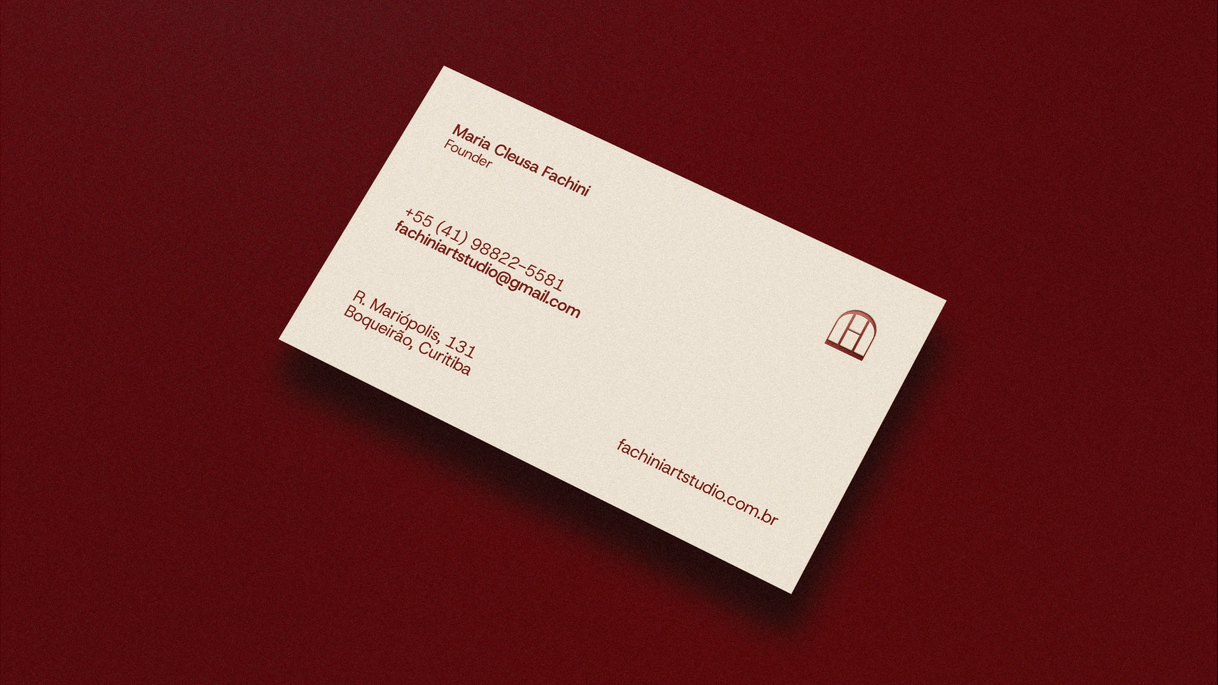
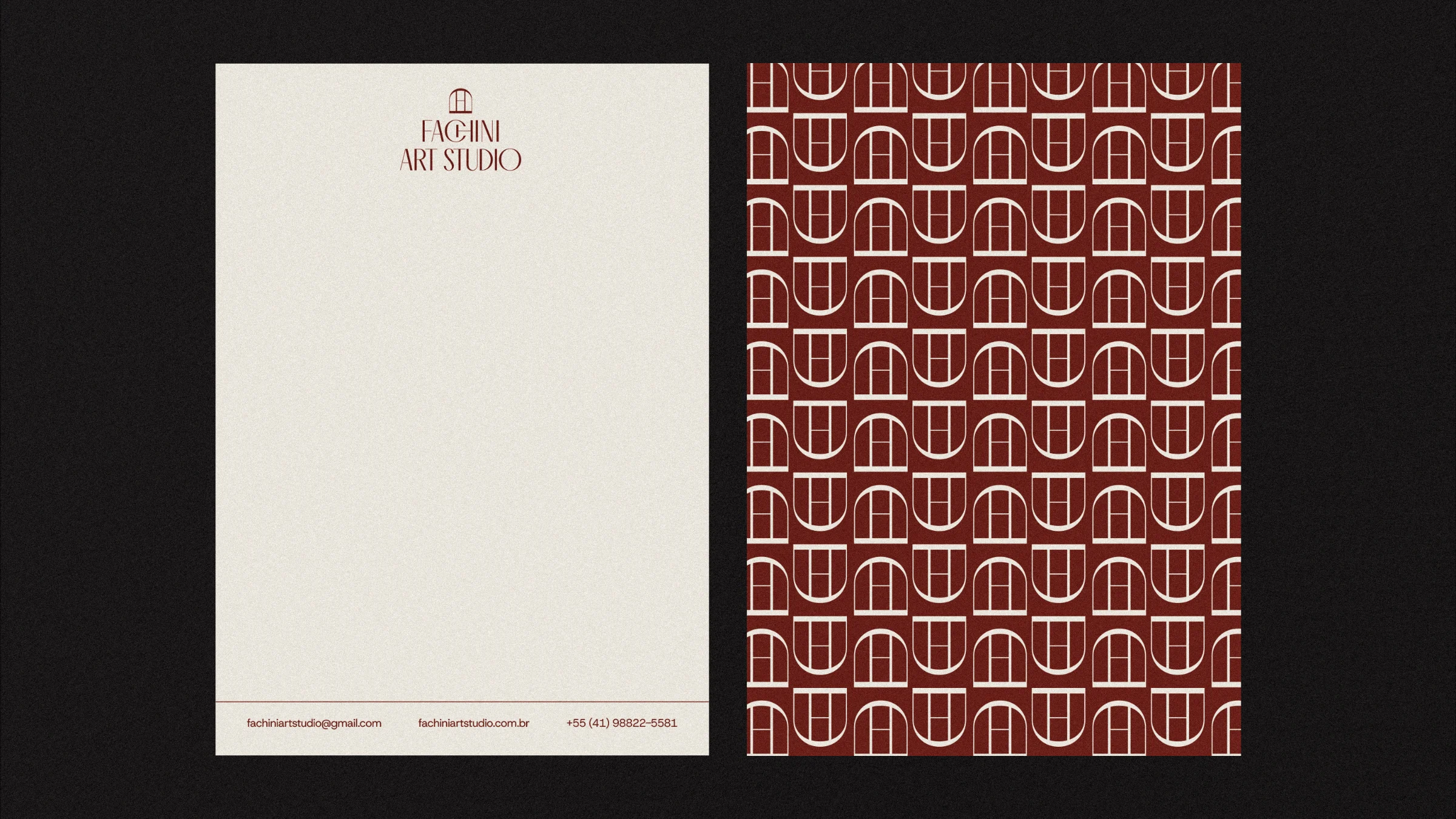
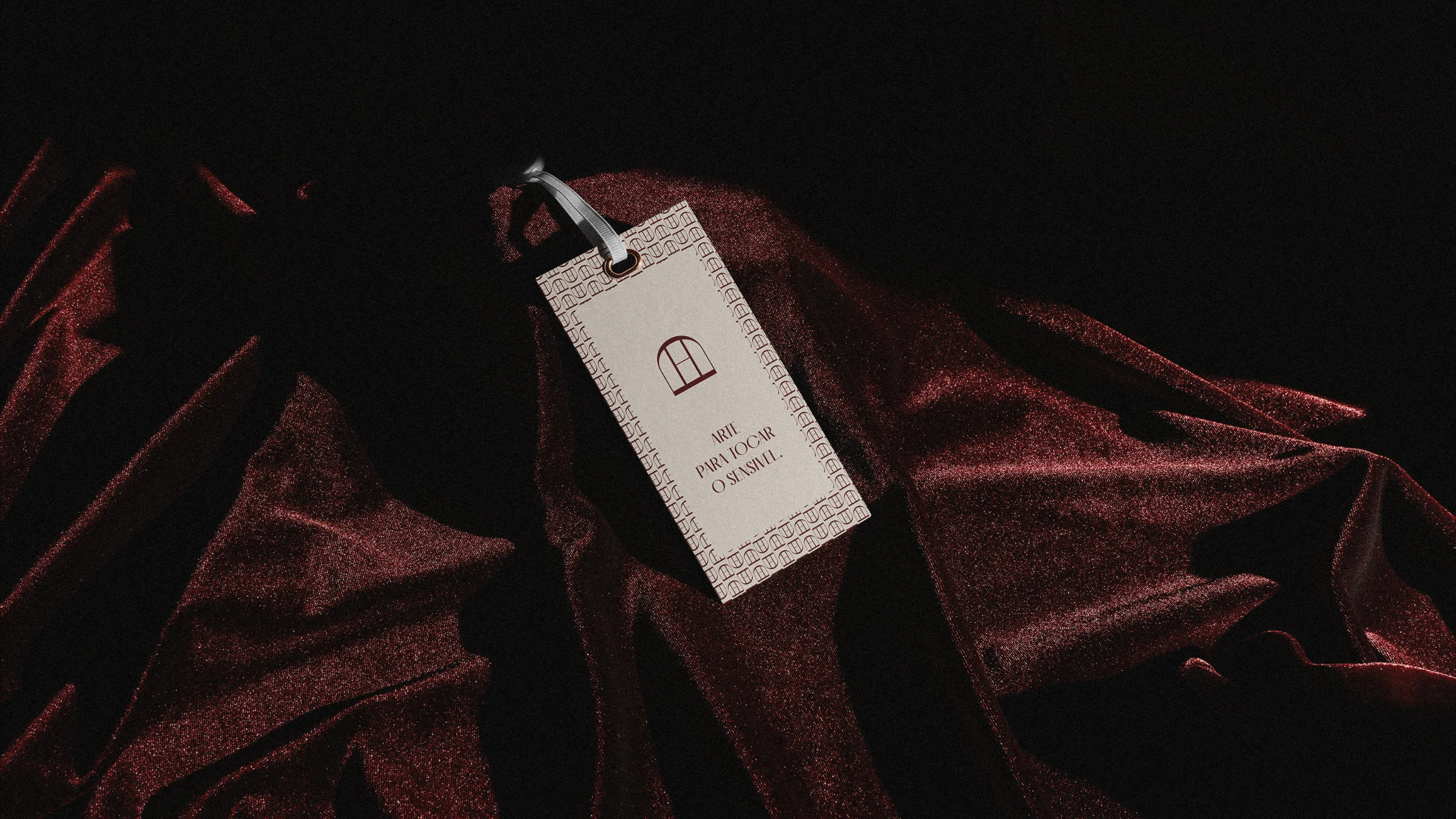
The symbol comes from the idea of a window, a passage between inside and outside, between what is felt and what is revealed. It works alone or next to the logotype. A pattern of repeated arches and windows in burgundy over beige extends it across surfaces, while calligraphic strokes decorate cards and folders.
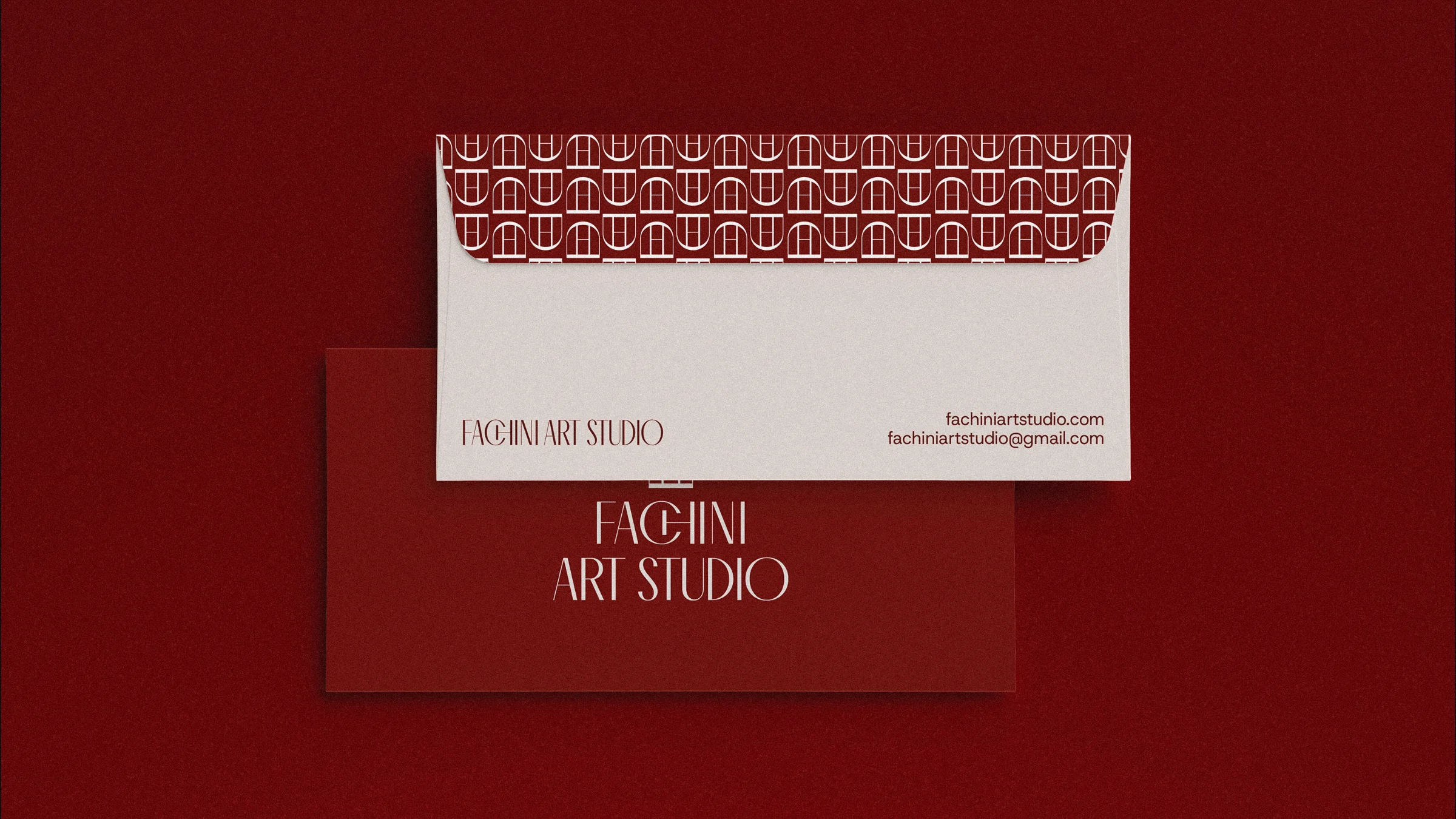
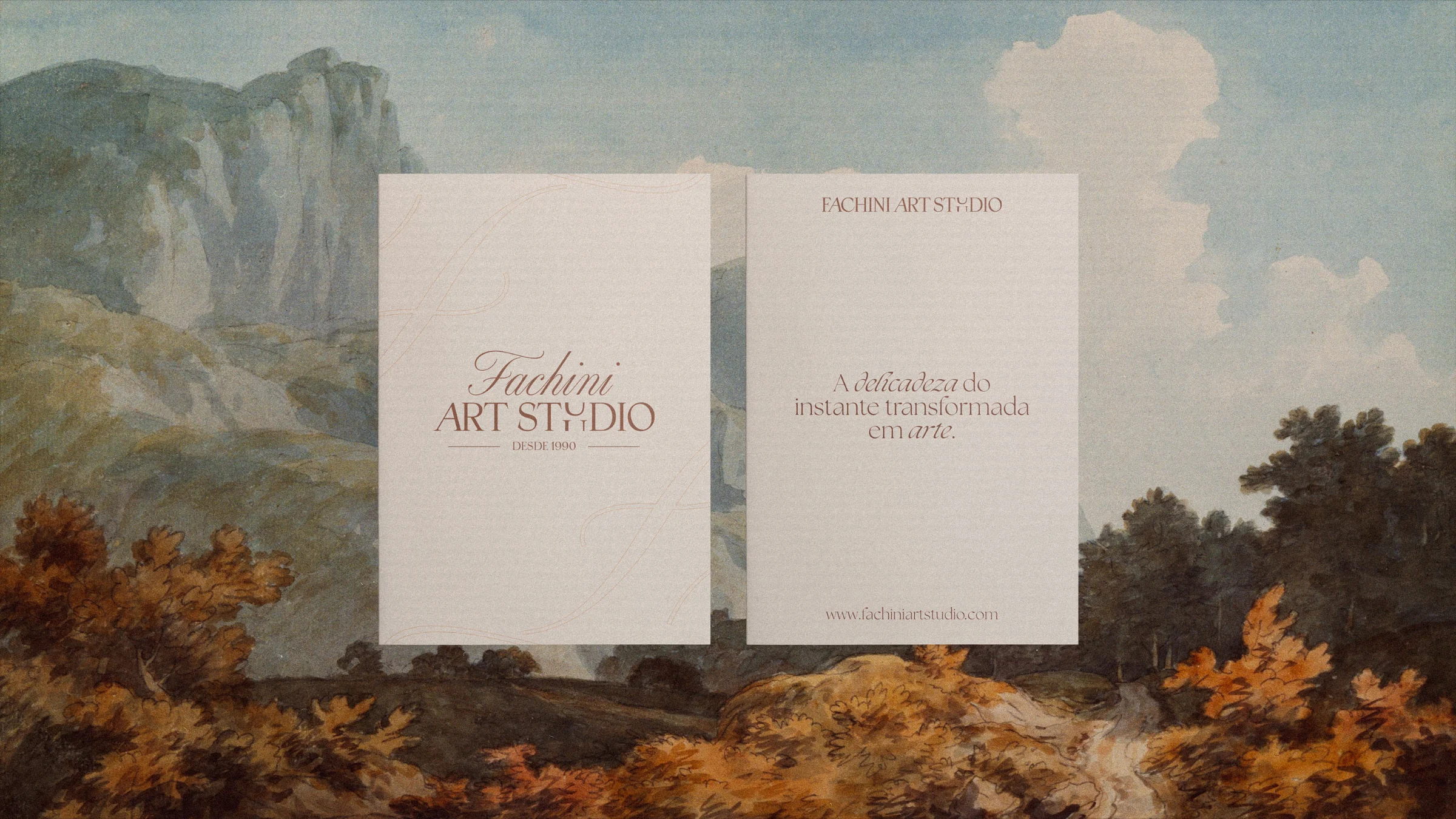
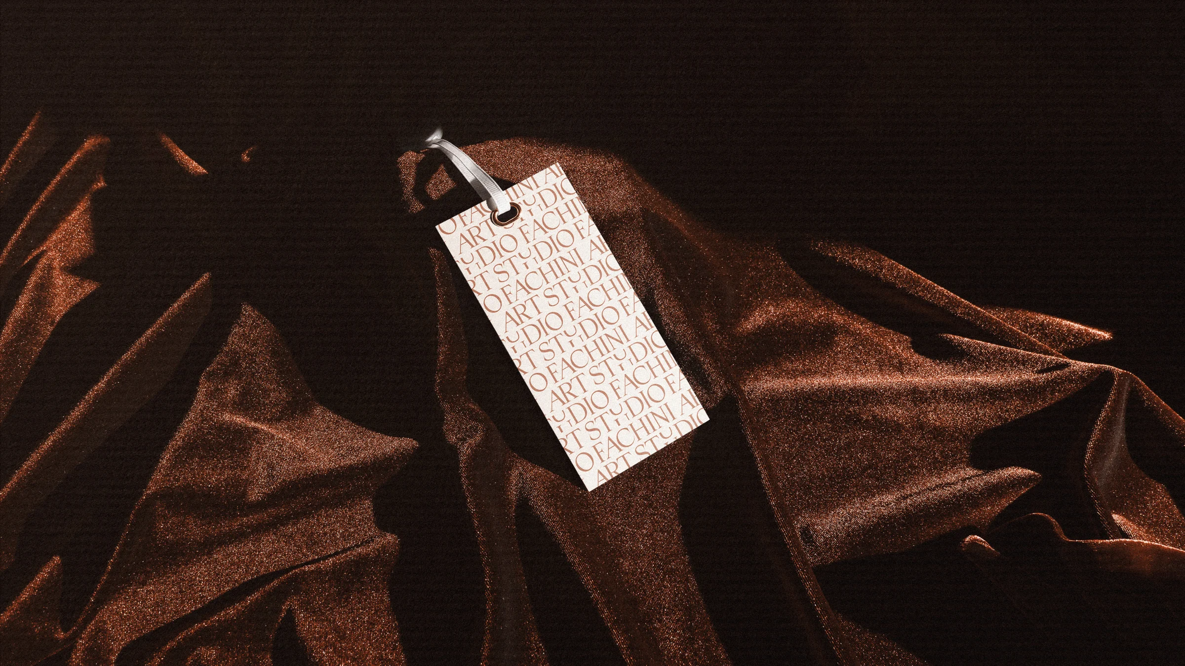
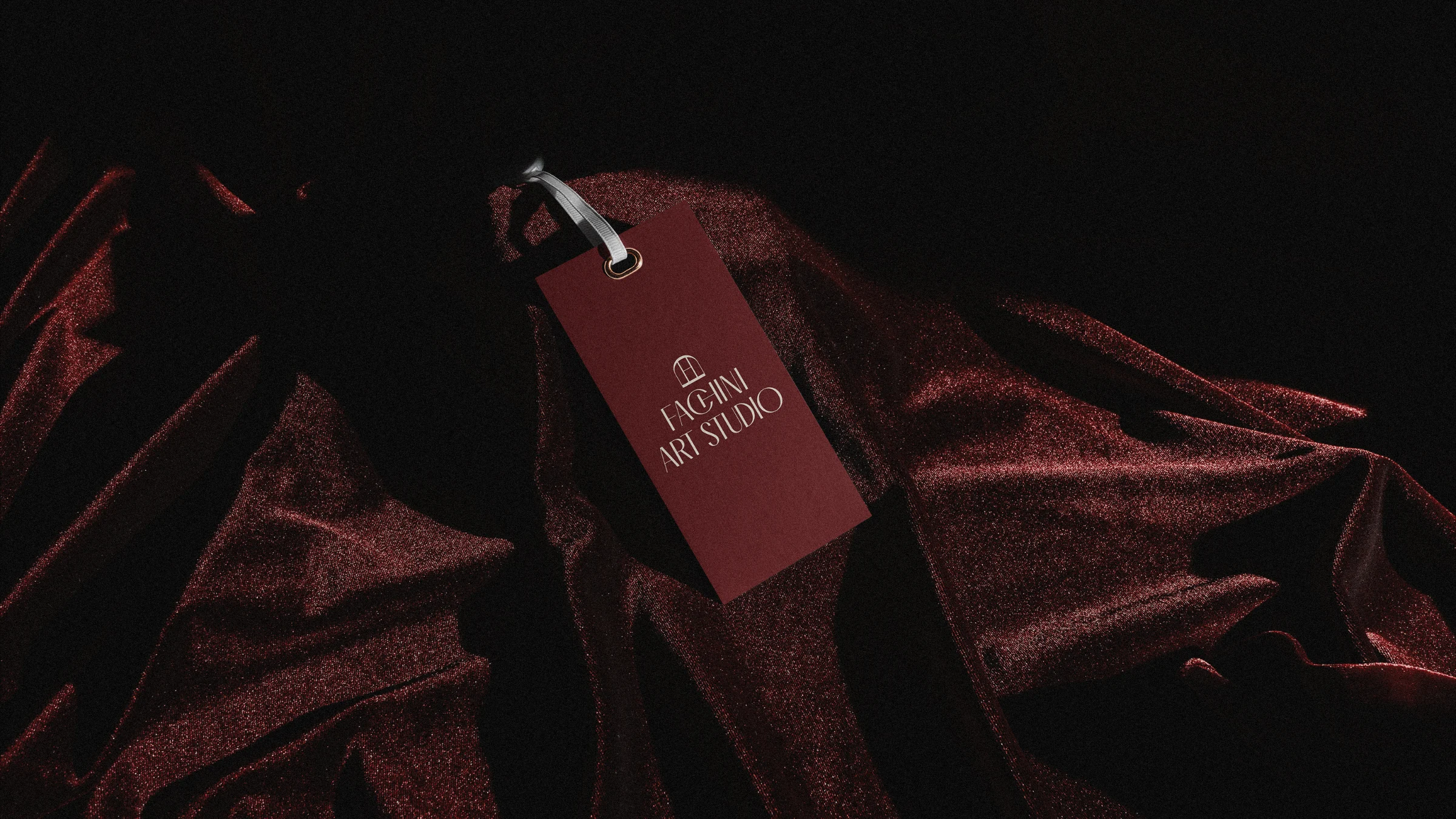
Art direction draws on classical painting. Earth-toned landscapes sit behind the logotype, burgundy velvet carries the tags, and natural light with long shadows treats mockups like objects in a collection. Venus, from Botticelli, anchors the campaign pieces in olive green.
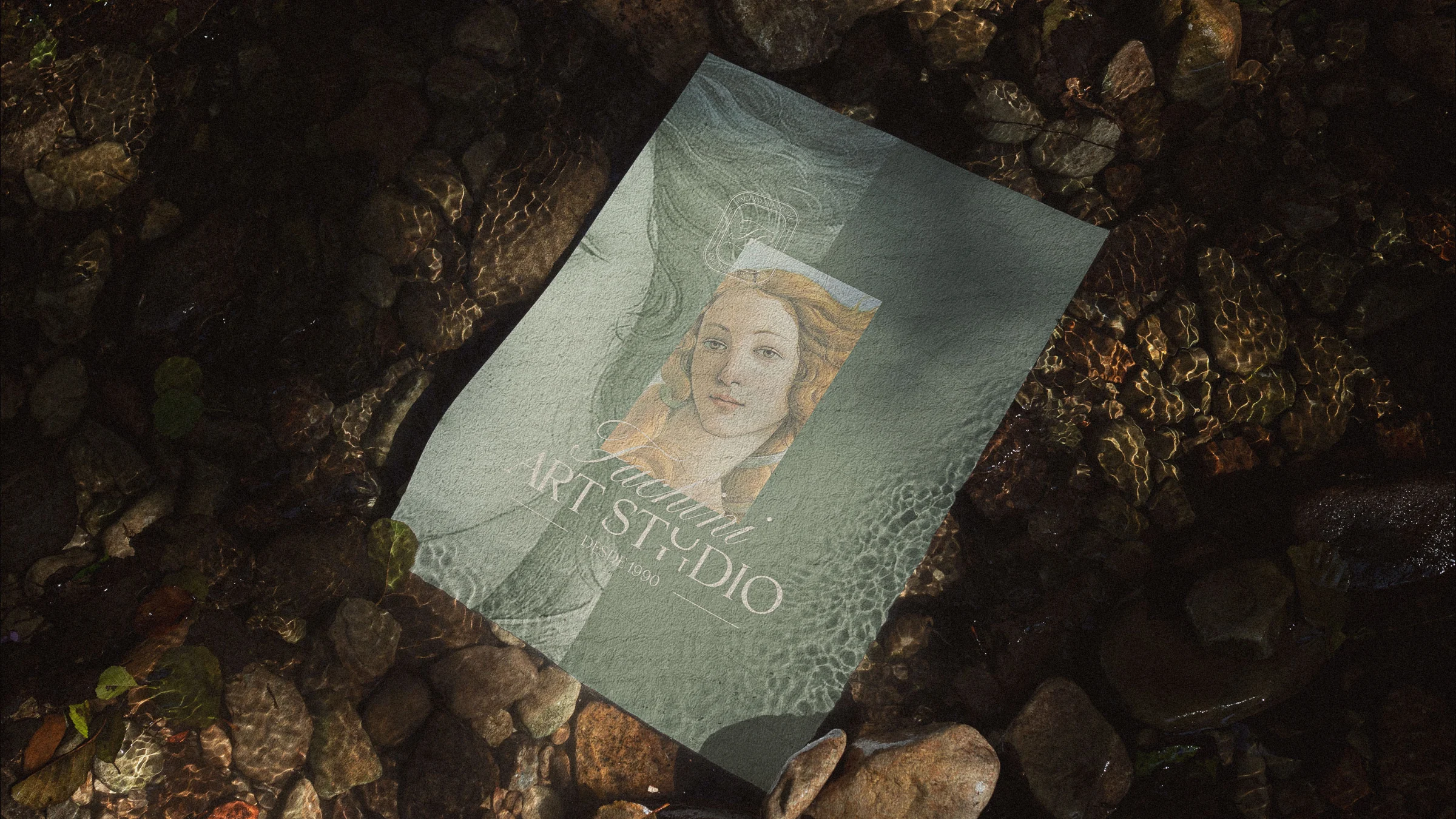
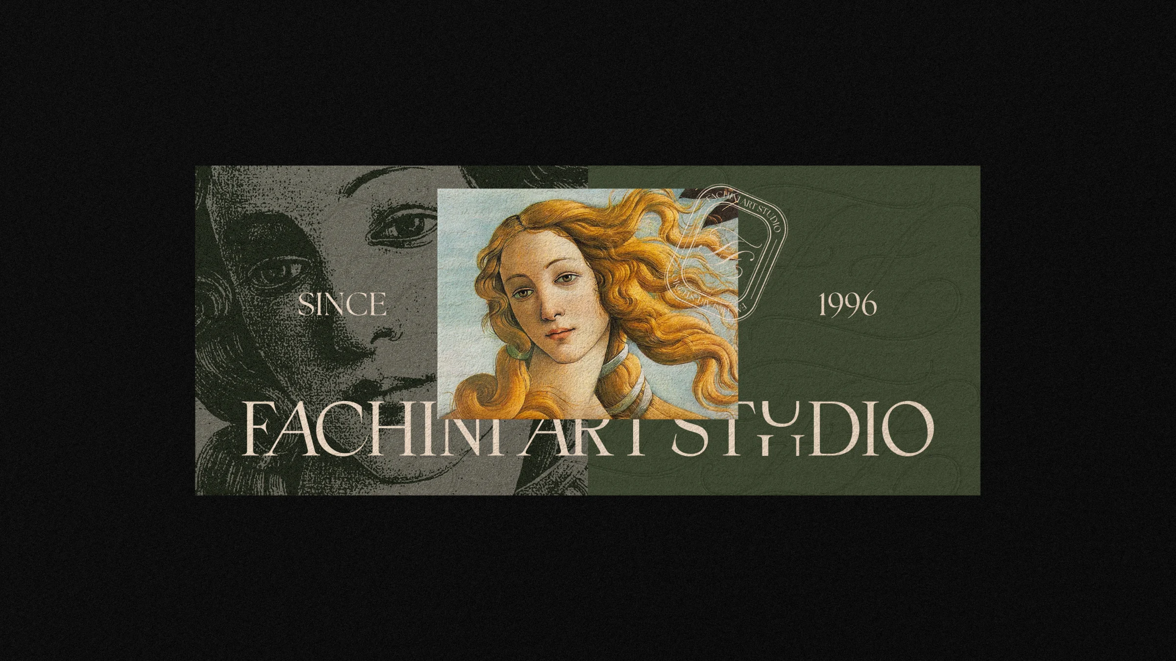
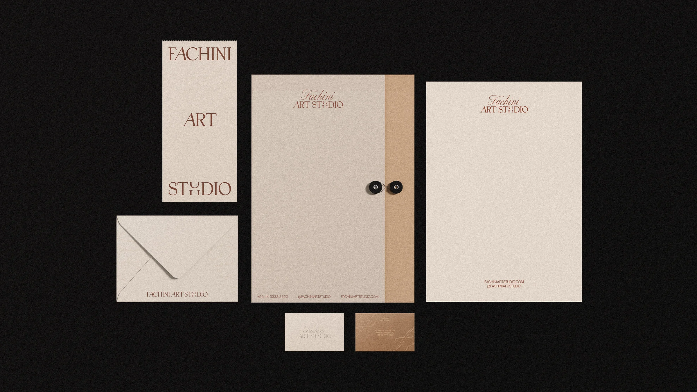
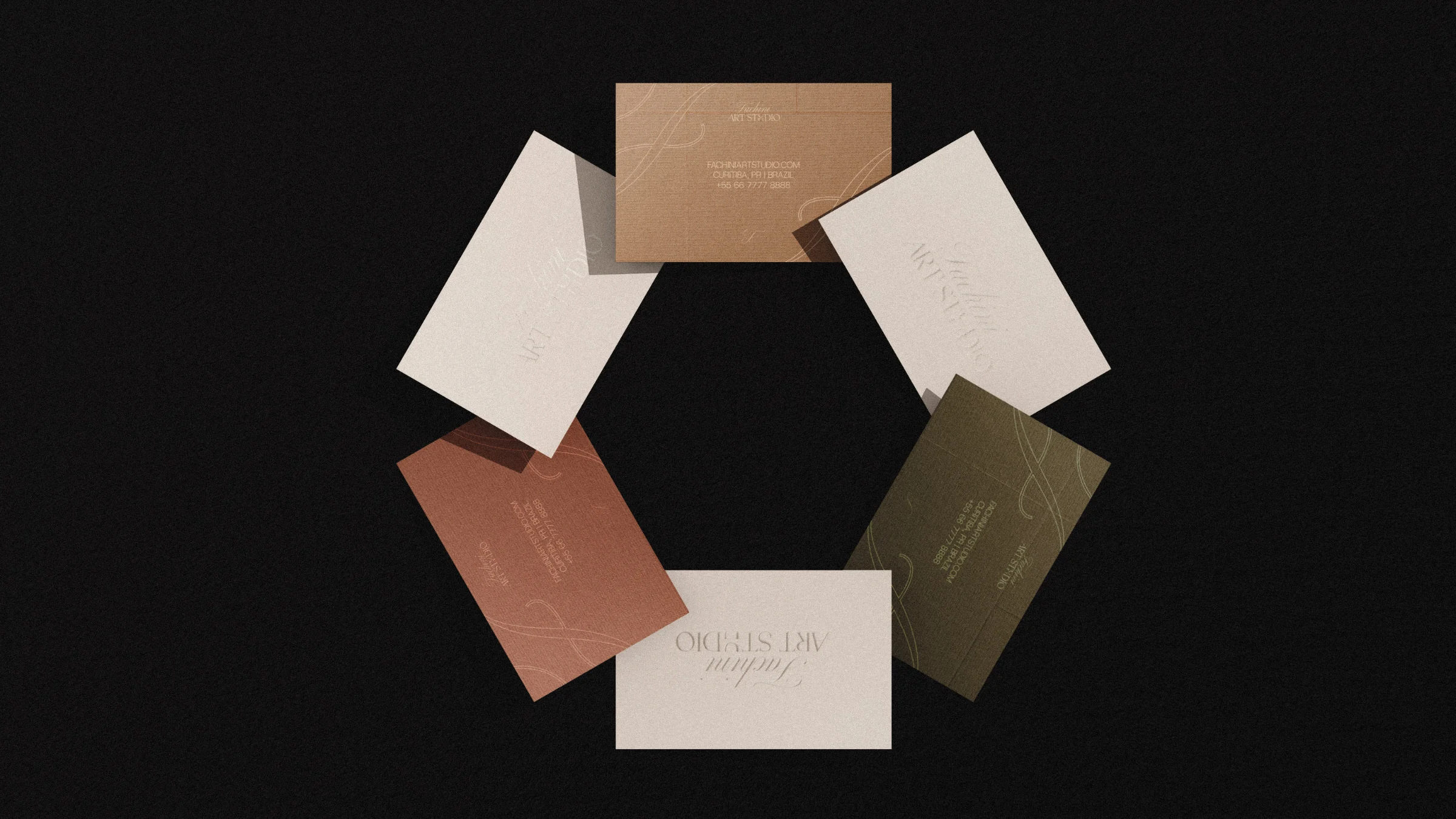
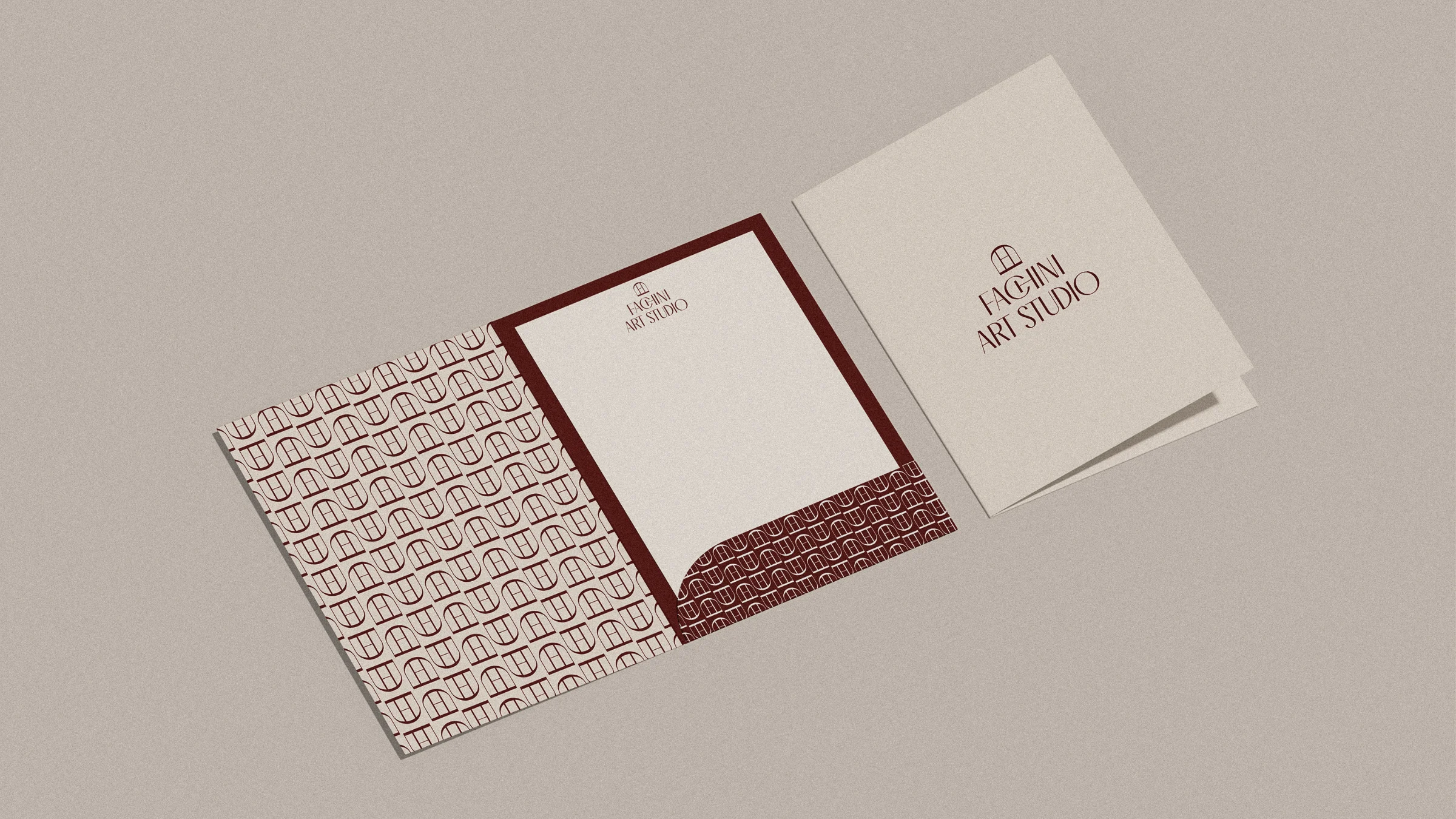
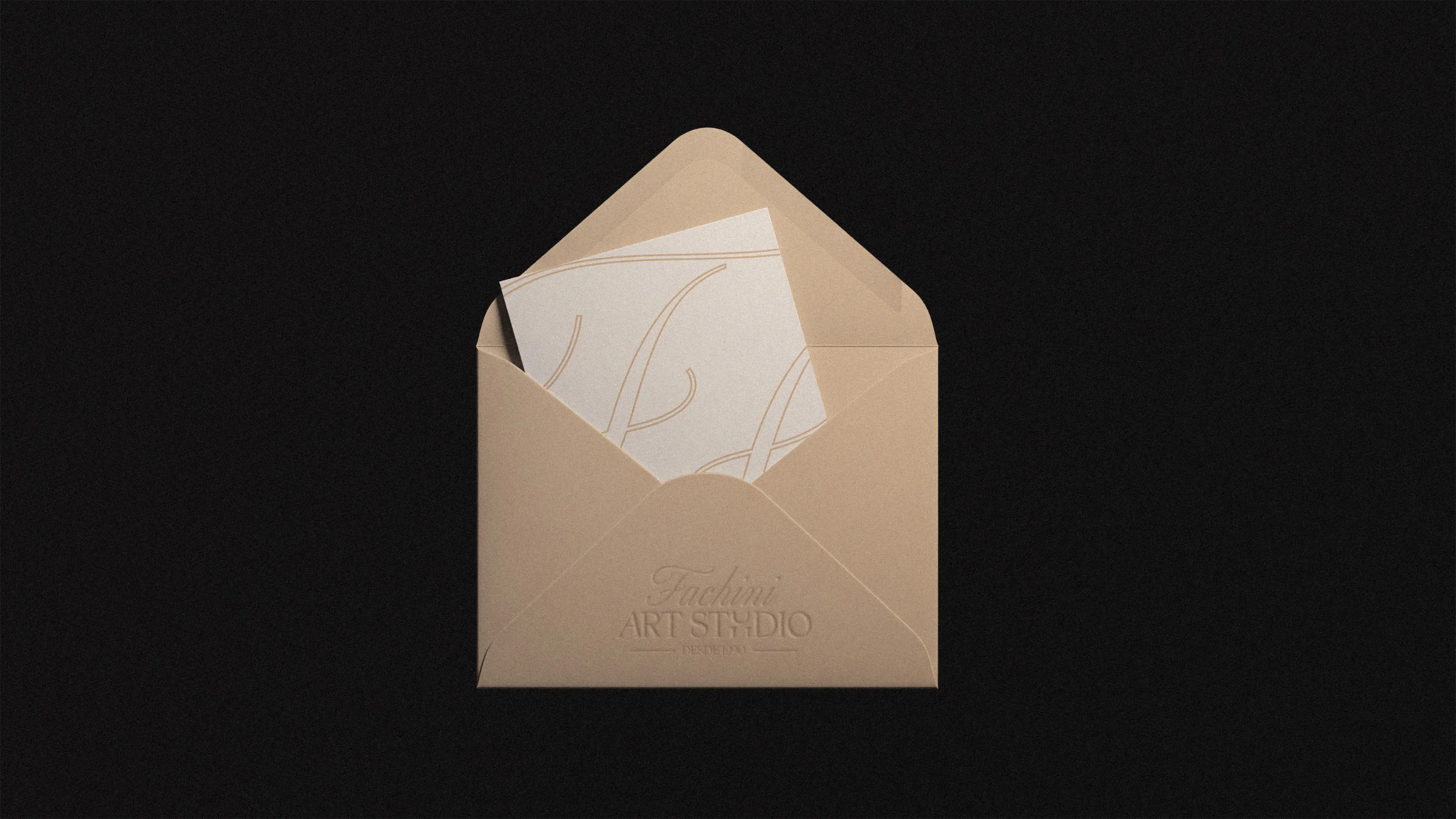
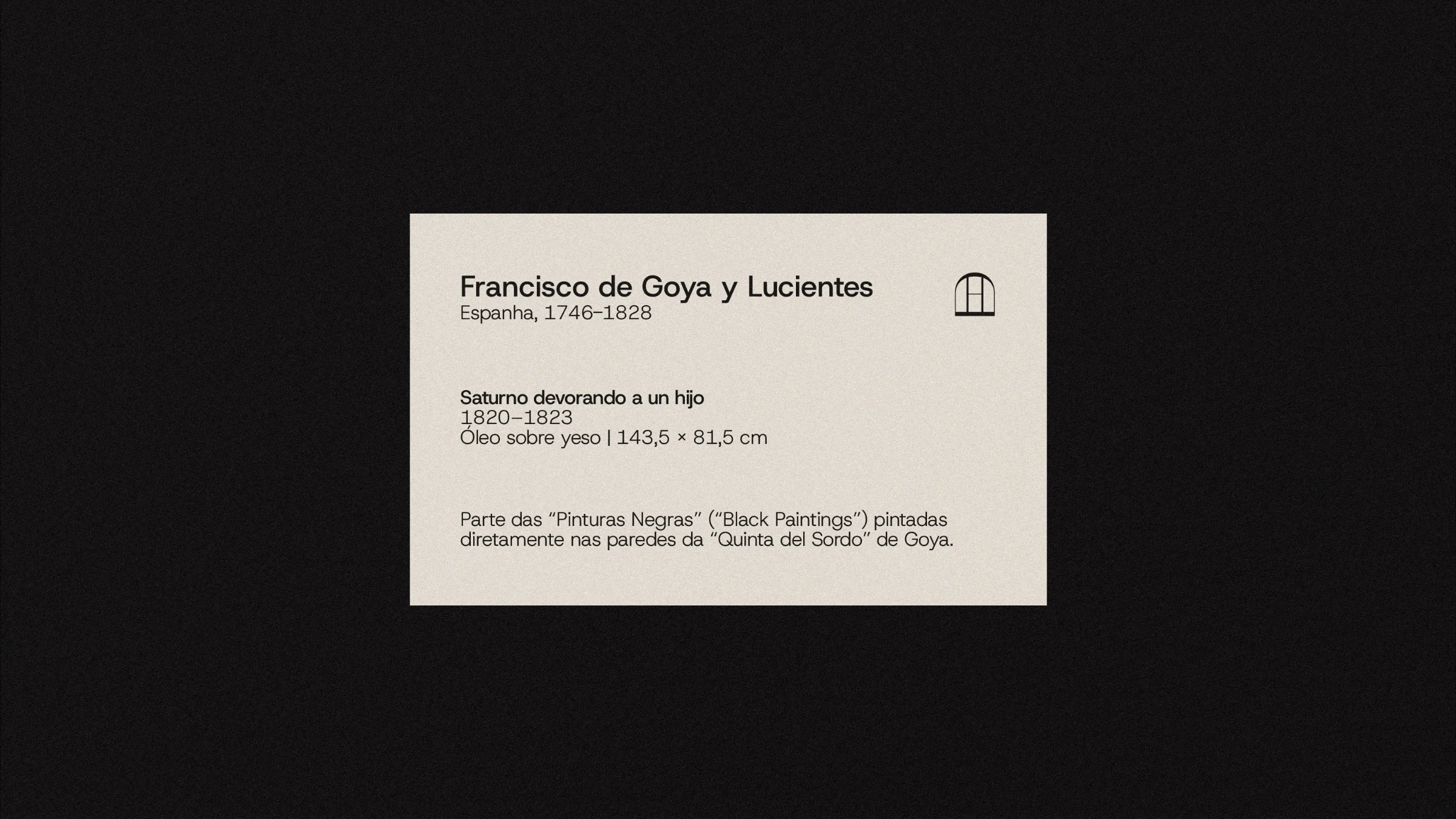
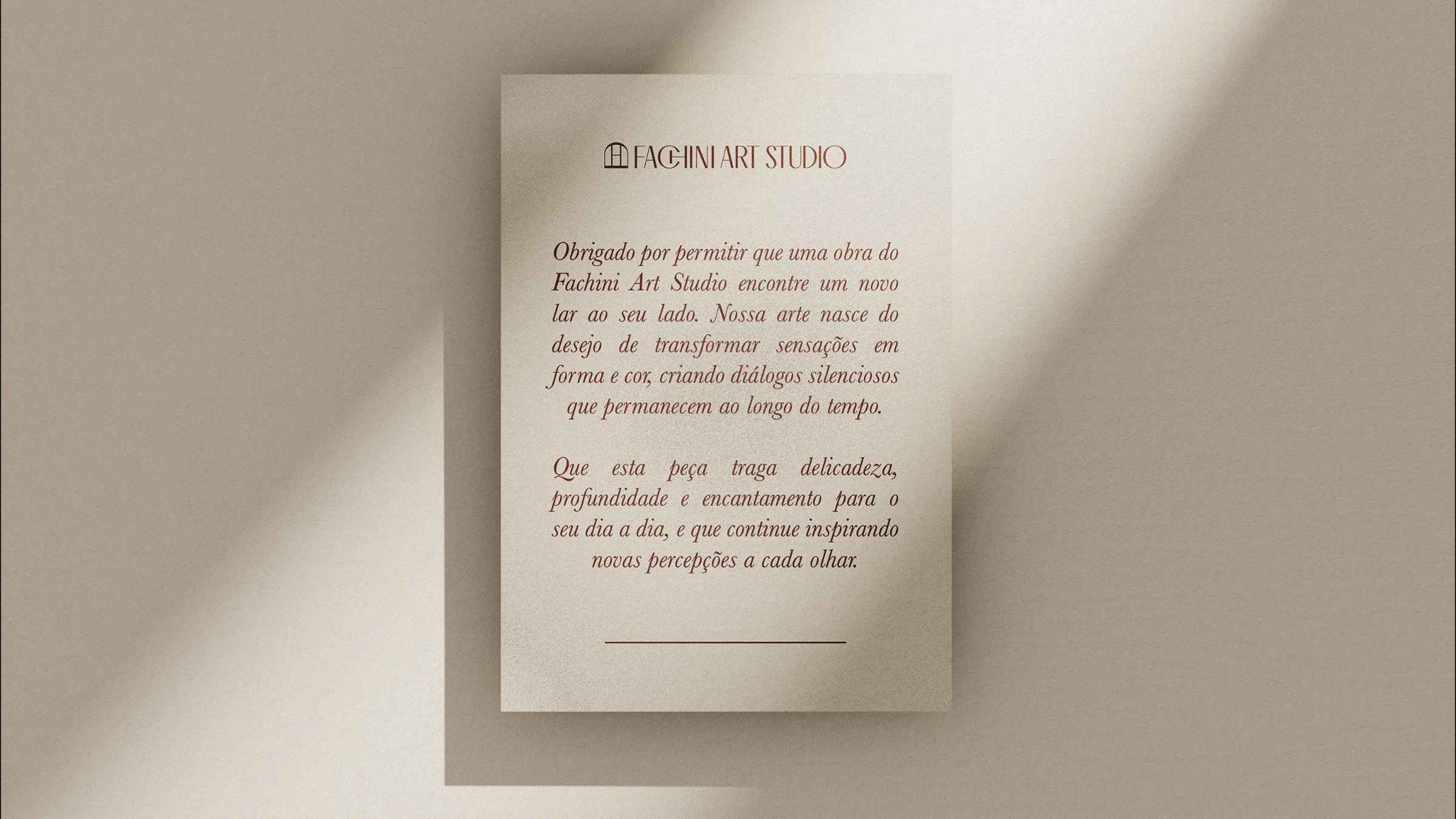
The system covers business cards, letterhead, office and bag envelopes, a folder, artwork labels, thank-you notes, tags with ribbon, a facade banner and a billboard. The artwork label, with text about Goya, borrows the language of museums. The thank-you note uses italic serif text with an affectionate tone.
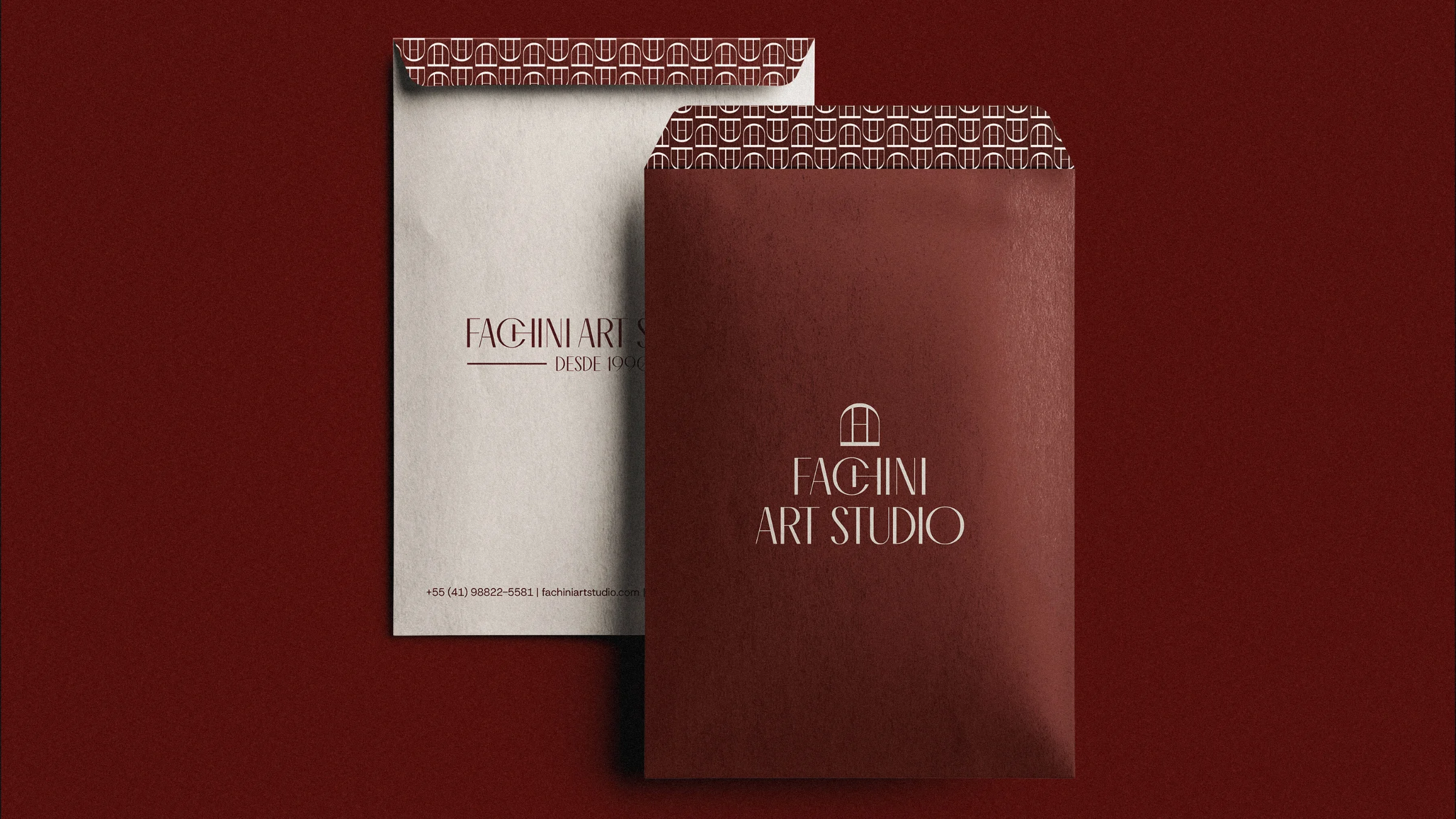
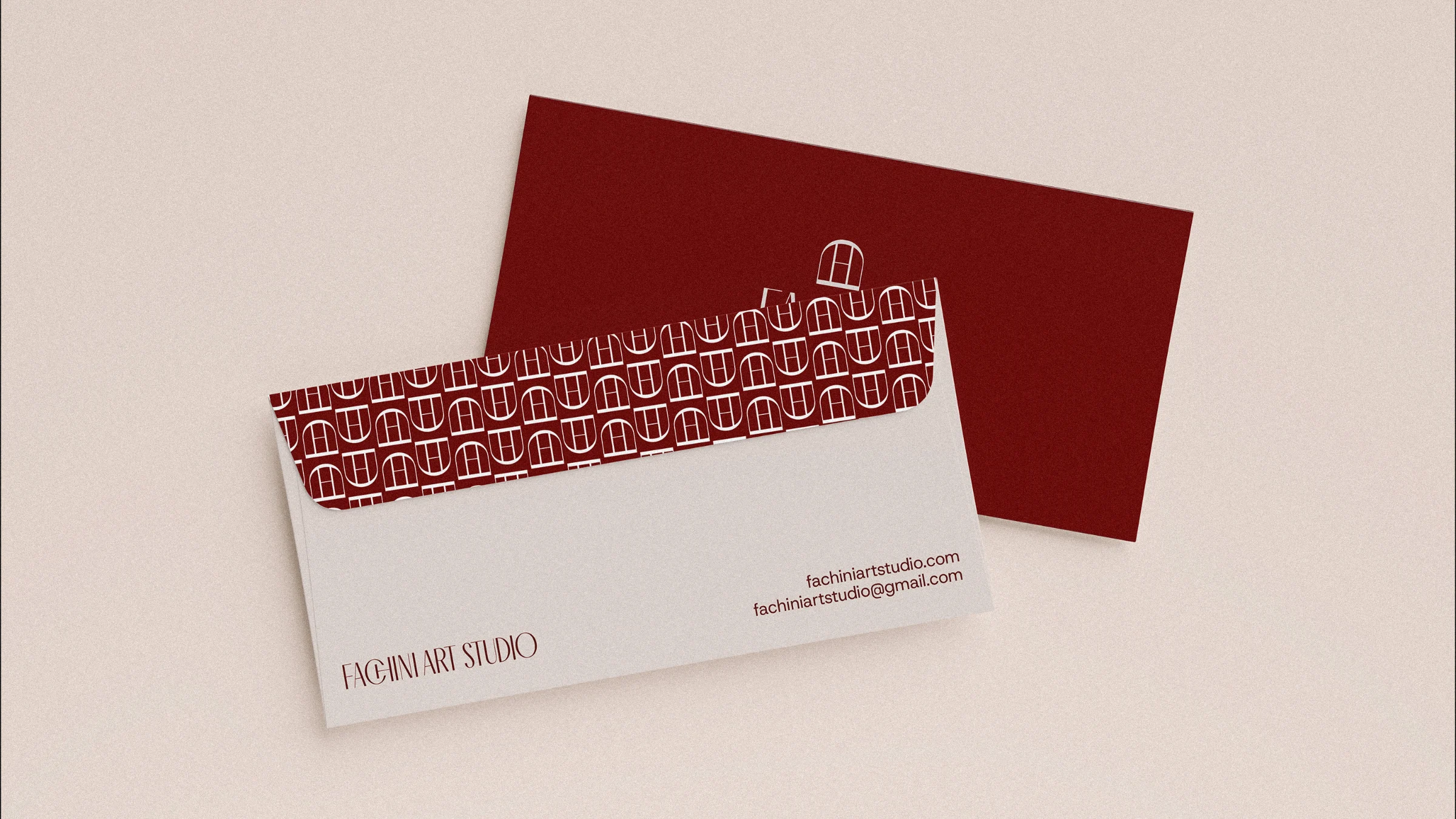
The studio now has a brandbook of 56 pages and a set of templates for stationery, labels, notes and communication pieces. With one symbol, one pattern and a fixed palette, new applications can grow without losing the quiet tone the brand was built on.
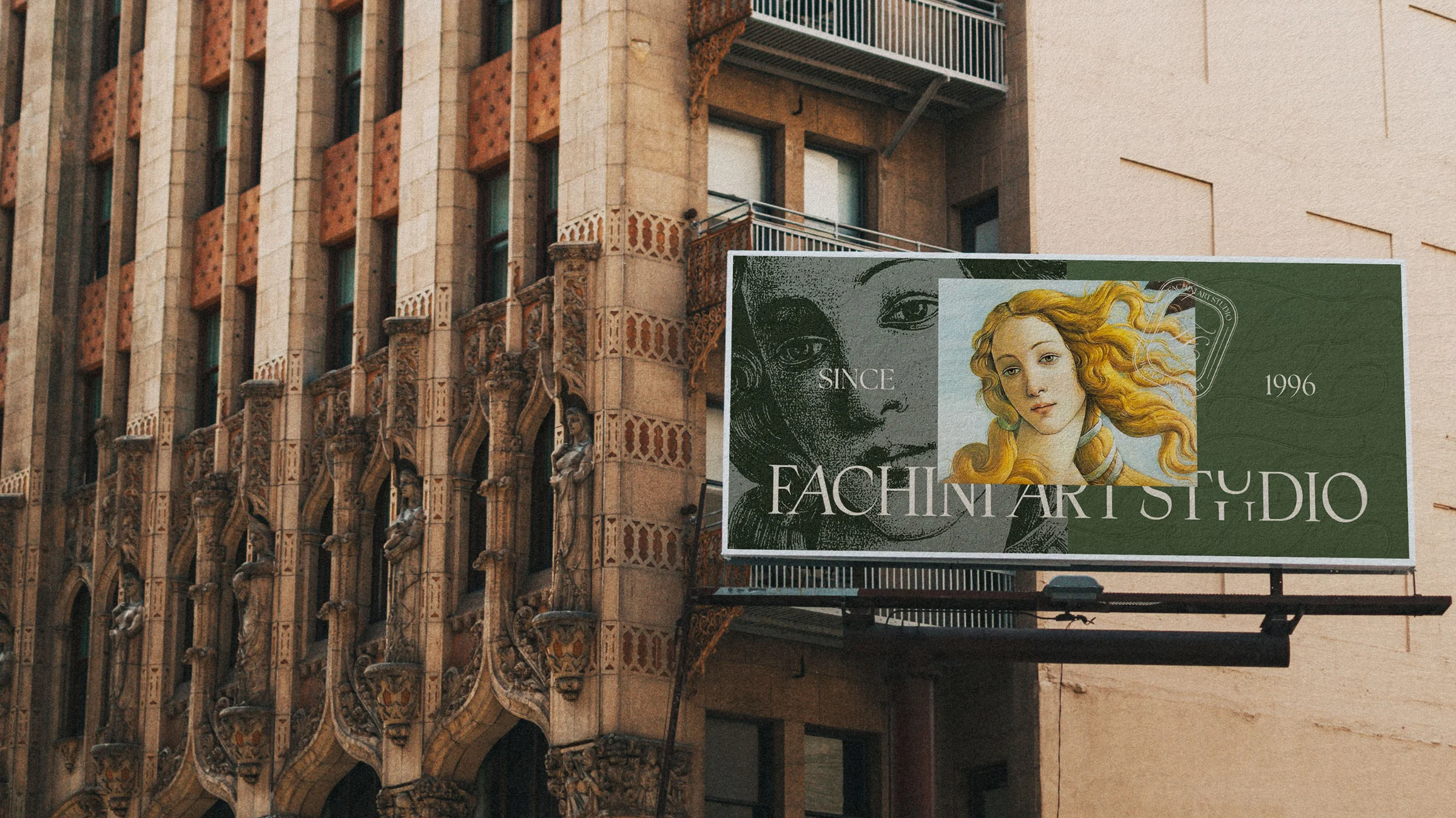
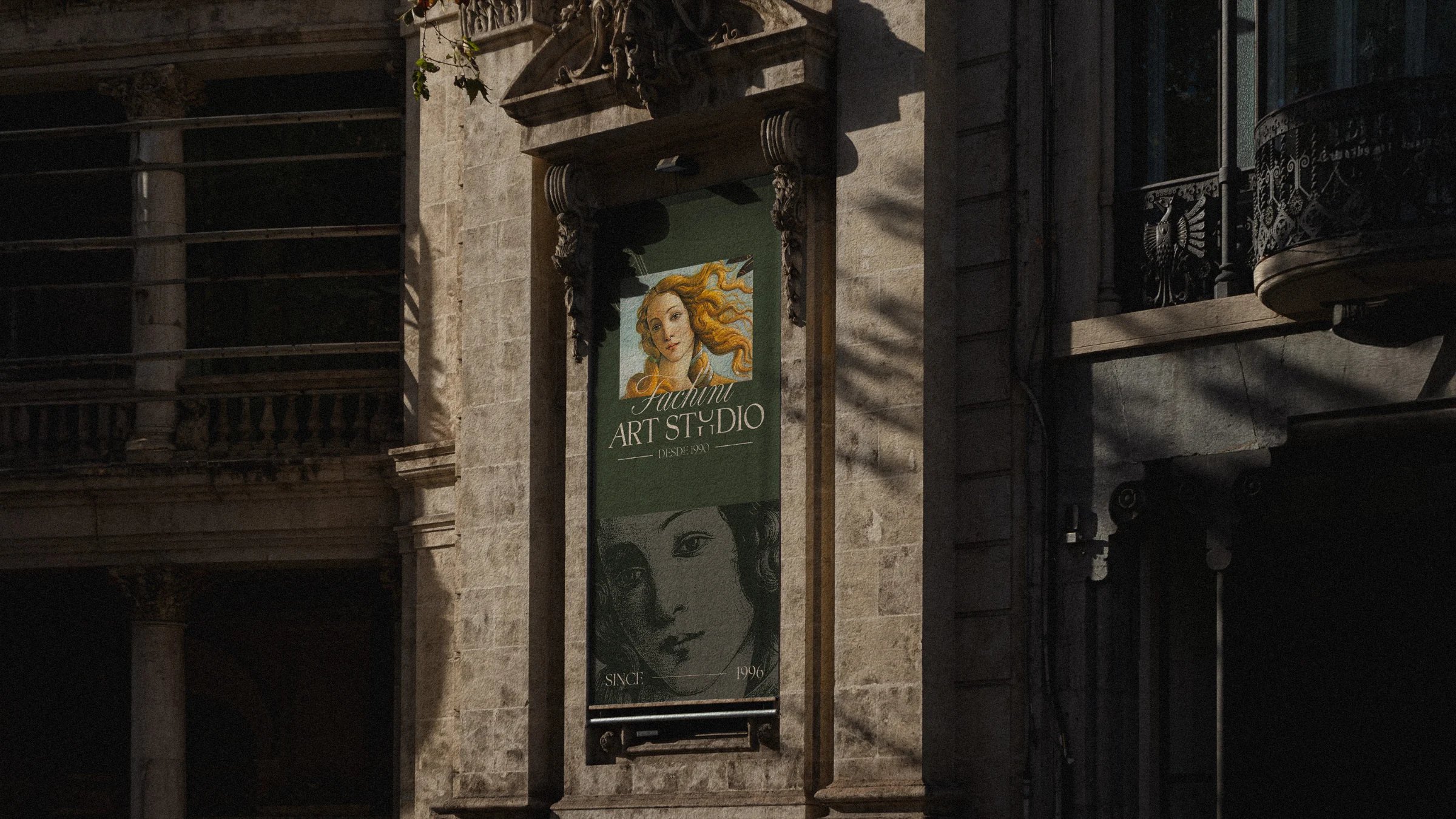
Project created in 2025 at Casasanto Design.
Brand strategy and branding: Guilherme Casasanto
Copywriting: Guilherme Casasanto
Creative Direction: Guilherme Casasanto
Art Direction: Guilherme Casasanto
Graphic Design: Guilherme Casasanto
Todos os direitos são de propriedade da Fachini Art Studio.