 say hi — guilherme@casasantodesign.com
KV | Desapega Bigben
Elevating the cycle of gold into a tactile narrative of quiet luxury and renewal.
- Client
- Bigben
- Year
- 2025
- Scope
- Campaign
- Studio
- Annexo

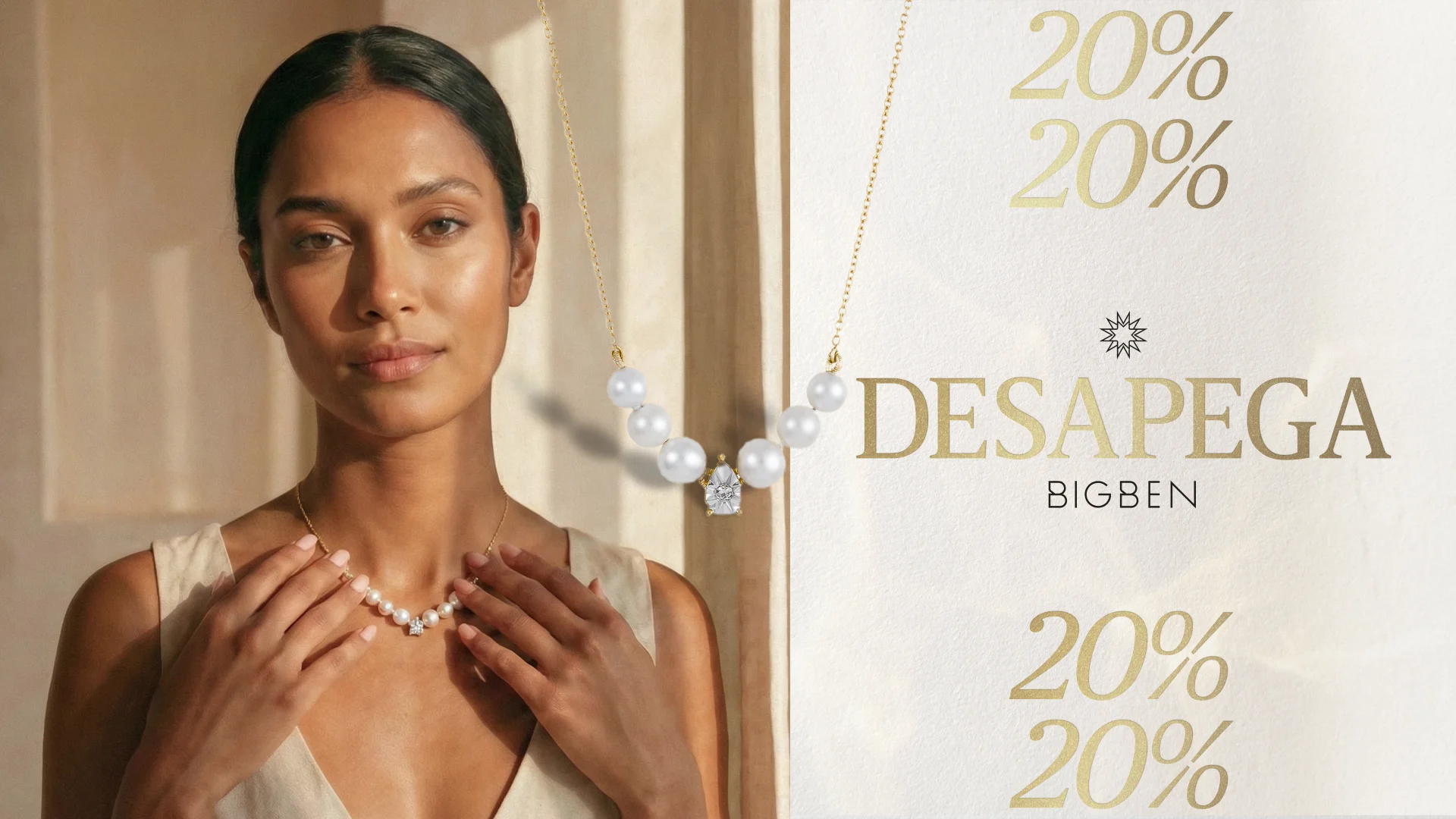
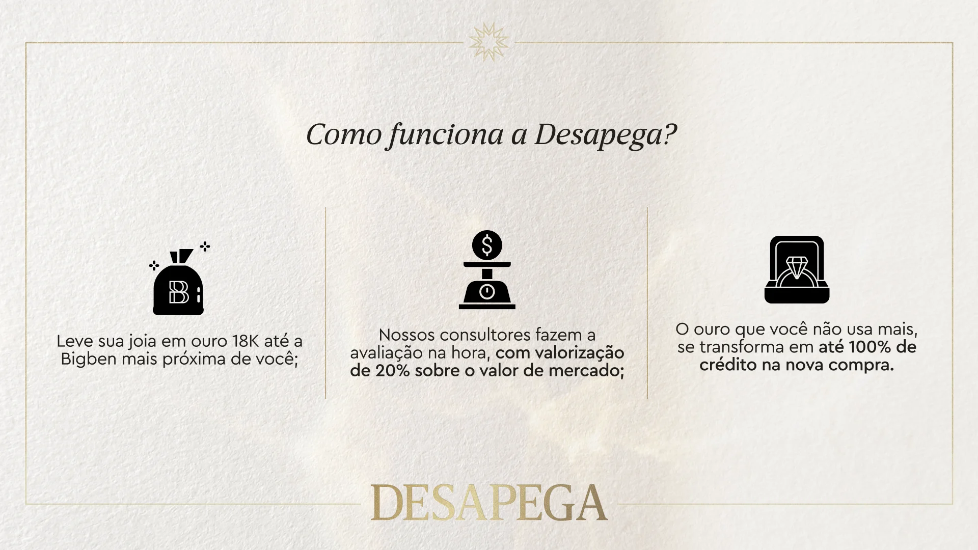
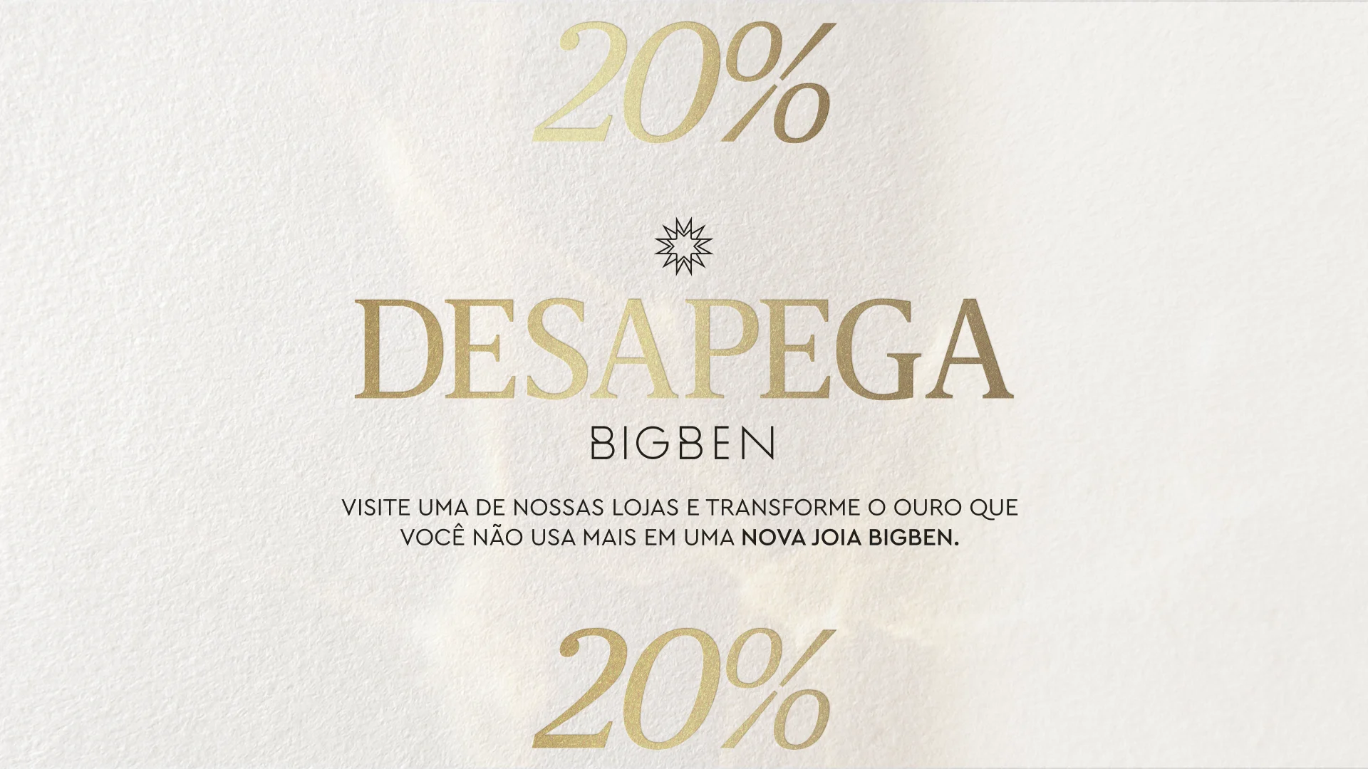
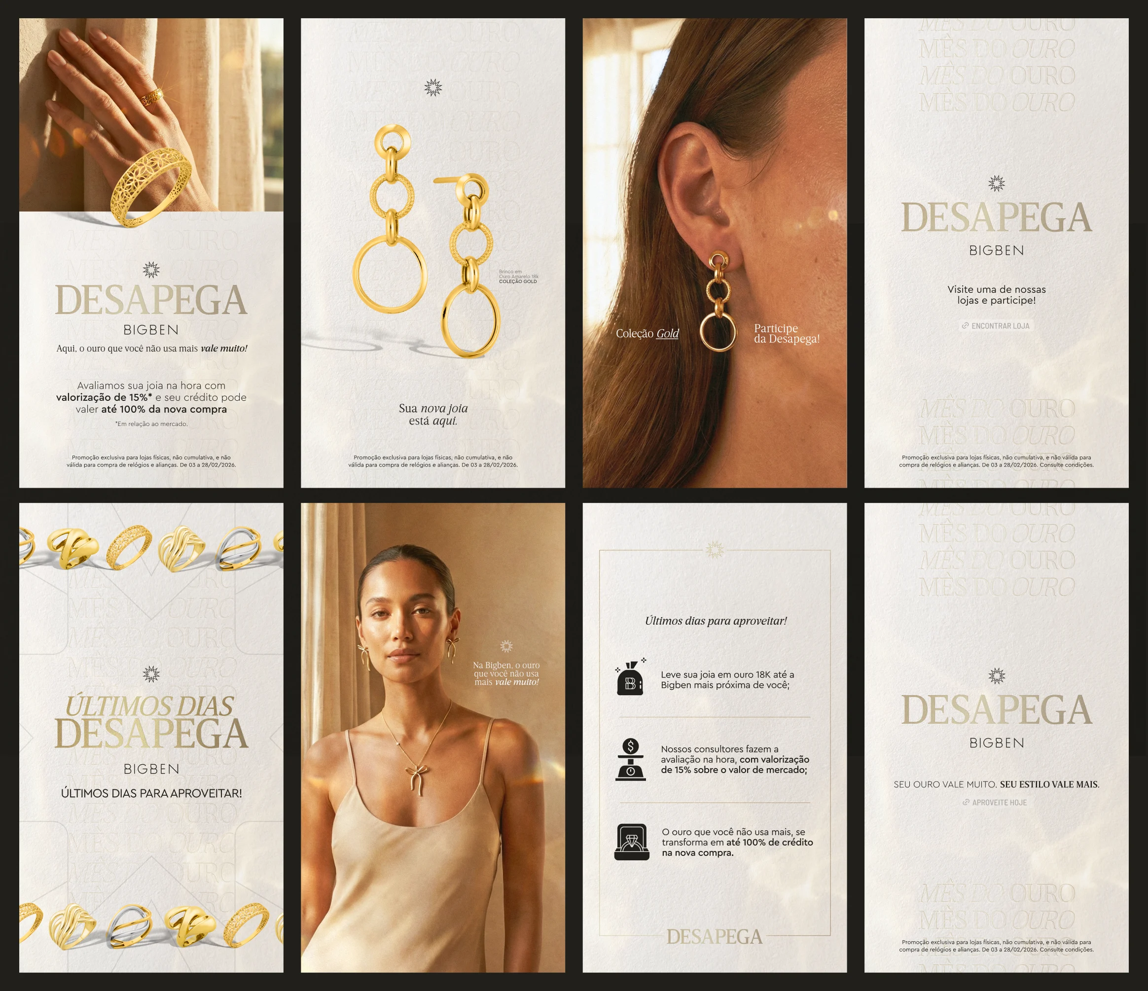
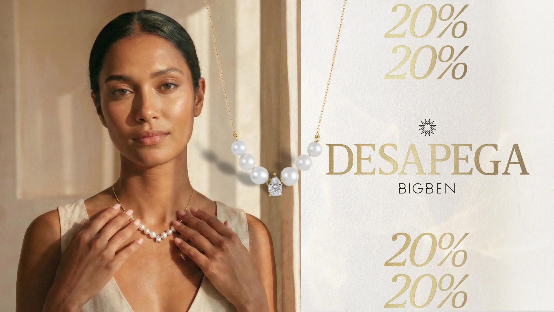
“Desapega” is Bigben’s annual gold exchange campaign, traditionally a tactical retail action. The challenge was to shift the perception from a mere financial transaction—selling old jewelry—to an aspirational lifestyle upgrade. The goal was to communicate value and opportunity without losing the brand’s inherent sophistication.
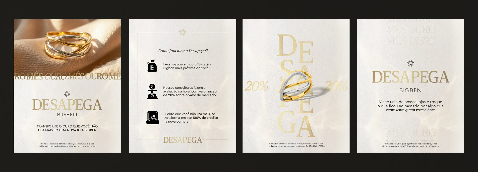
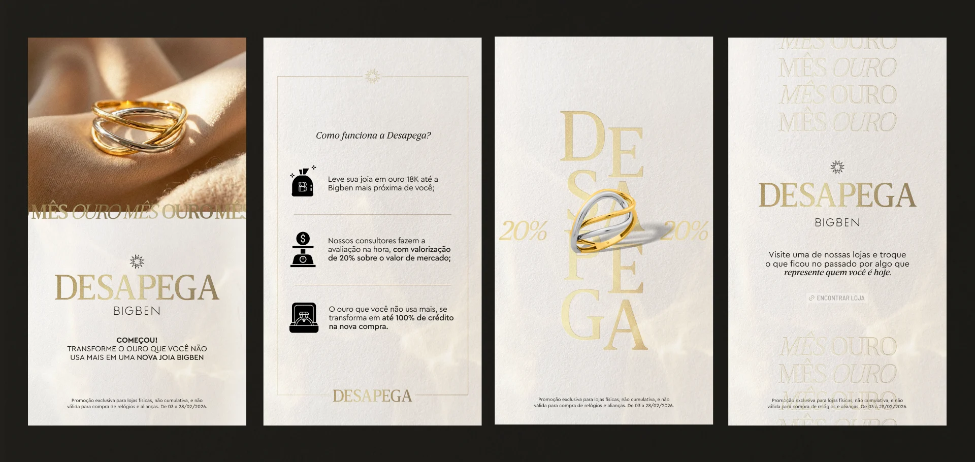
The core concept, “Your gold is worth a lot, your style is worth more,” drove the visual strategy. We moved away from the urgency of “letting go” to focus on the beauty of “renewing.” The campaign positions gold not just as a commodity, but as a vehicle for self-expression that evolves alongside the customer.
Breaking away from the heavy institutional burgundy, the art direction embraced a “Fresh & Premium” palette suitable for February—the month of gold. We utilized organic textures of linen, raw cotton paper, and soft off-white tones to create a sensory experience. This “Quiet Luxury” aesthetic provides a clean, breathable canvas that allows the 18k gold to take center stage.
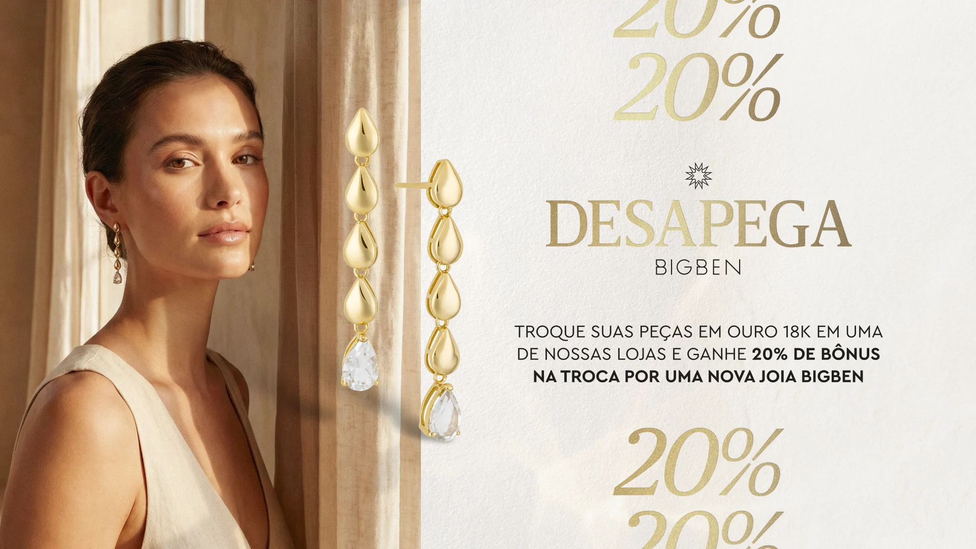
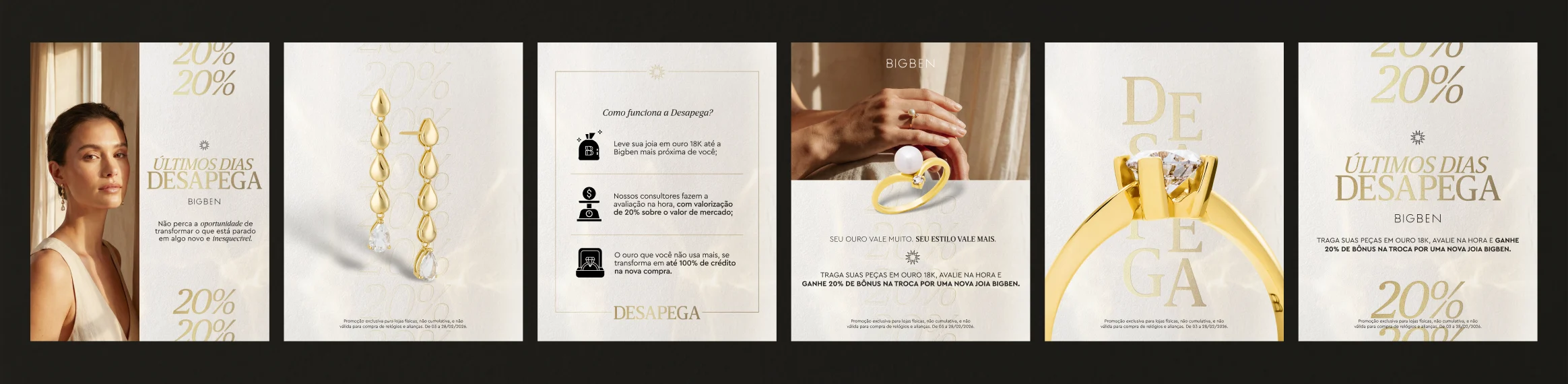
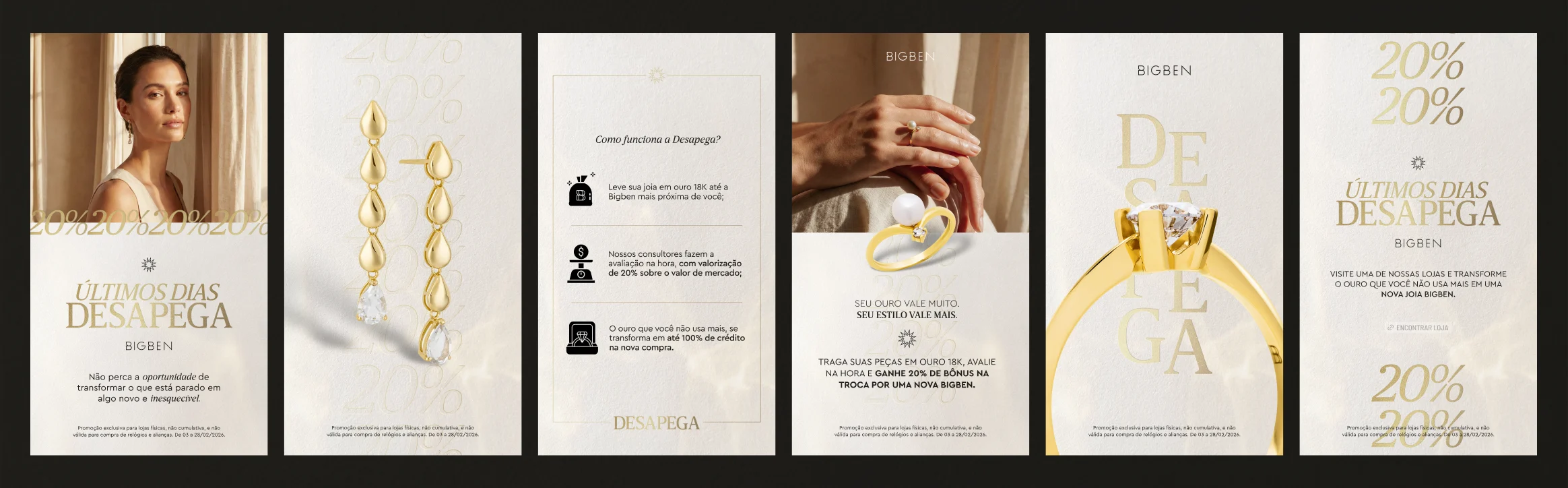
To draw a parallel between the timelessness of gold and the craft of design, the campaign identity features a letterpress effect. The debossed logo application on textured backgrounds evokes a sense of exclusivity and high-end print finishing. It is a subtle visual metaphor: just like gold, the design has weight, depth, and permanence.
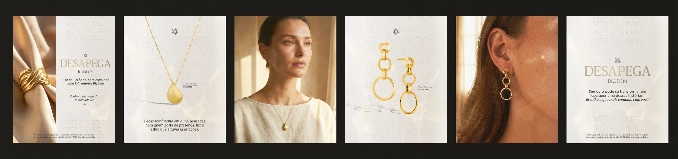
In a market saturated with generic visuals, this campaign carved out a unique space for Bigben. By prioritizing natural light, genuine materials, and a curated “editorial” look, the Key Visual differentiates the brand from major competitors. It transforms a standard retail promotion into a refined visual story rooted in elegance and brand strength.