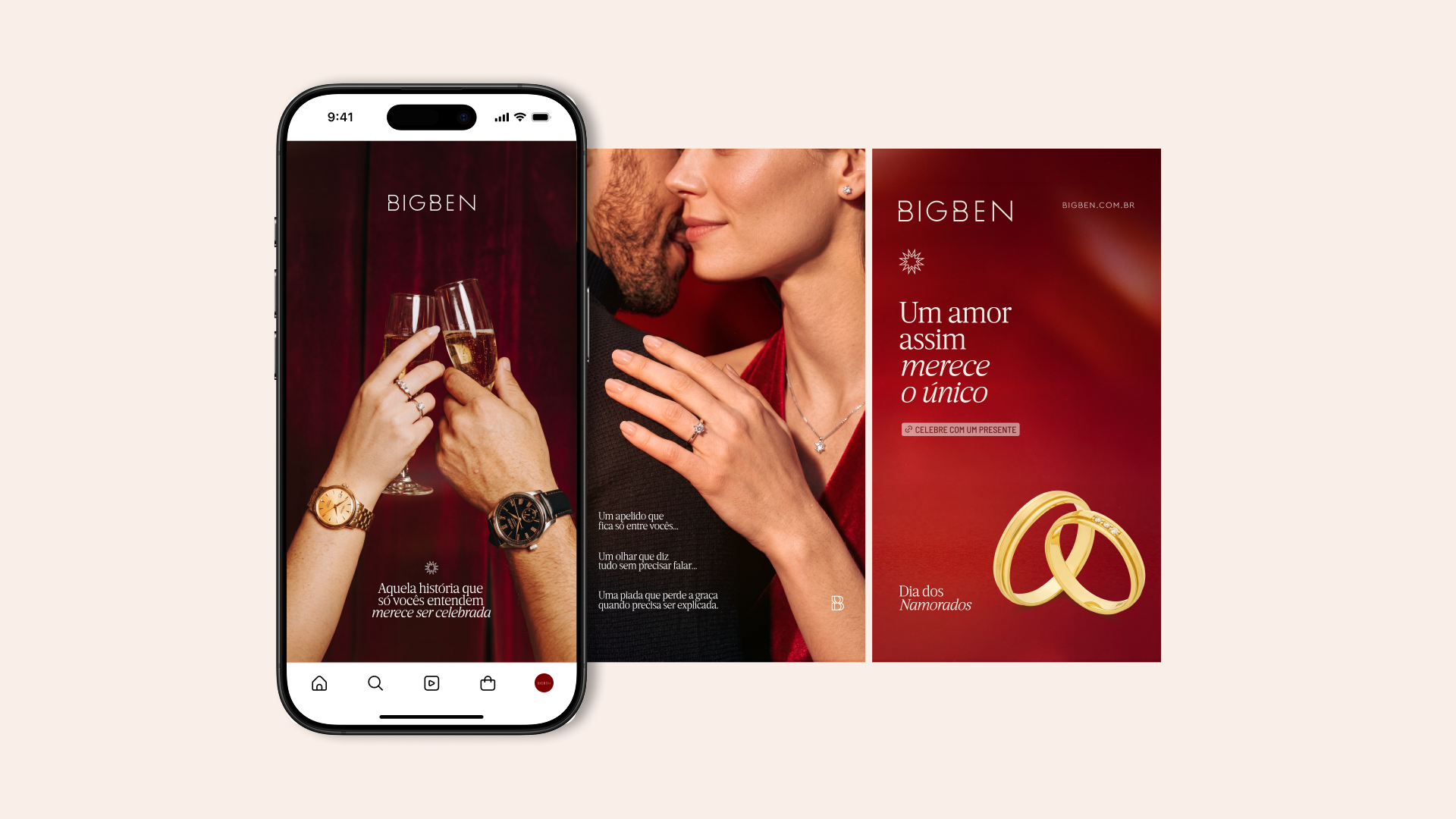
The jewelry retail sector often saturates Valentine’s Day with commercial idealizations and movie clichés. Bigben’s strategic challenge was to break this visual homogeneity by addressing a real consumer pain point: the fear of making the wrong choice and giving a predictable gift devoid of personal meaning. Instead of positioning the product as a mere object of commercial exchange, the strategy shifted the brand into the territory of affective luxury, transforming the jewelry into the unique element capable of materializing the particular and irreplaceable universe of each couple.
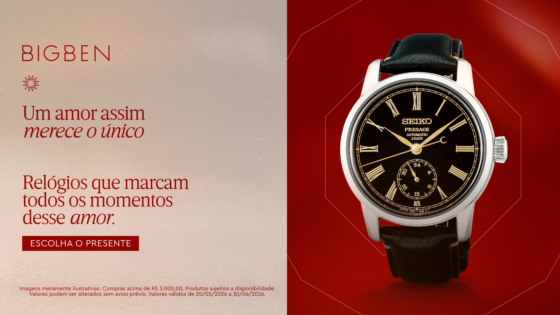
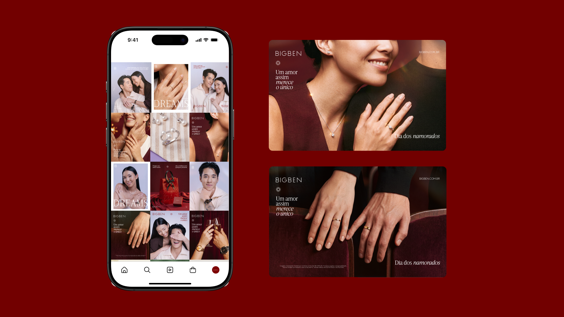
Semiotically, the campaign operates on the concept of the “secret code.” Nicknames that never leave the house, inside jokes, and glances exchanged in crowded rooms are the true pillars of human connection. The visual elements give weight to this intangible ecosystem through minimalist, high-contrast art direction. The massive use of a deep, velvety red evokes the weight of intimacy, while the masses of text breathe within a cream-colored institutional grid, ensuring the product is perceived as sophisticated.
The development of the typographic craft was the turning point in establishing the campaign’s verbal authority. The deliberate alternation between a serif with classic proportions in the conceptual messages and a grotesque typography for technical support brought the necessary rhythm to the pieces. It’s not just about aesthetics; the visual hierarchy guides the viewer’s eye through the natural reading pattern, creating points of tension where the diamonds and gold receive the exact luminous focus, simulating the behavior of natural light in a controlled environment.
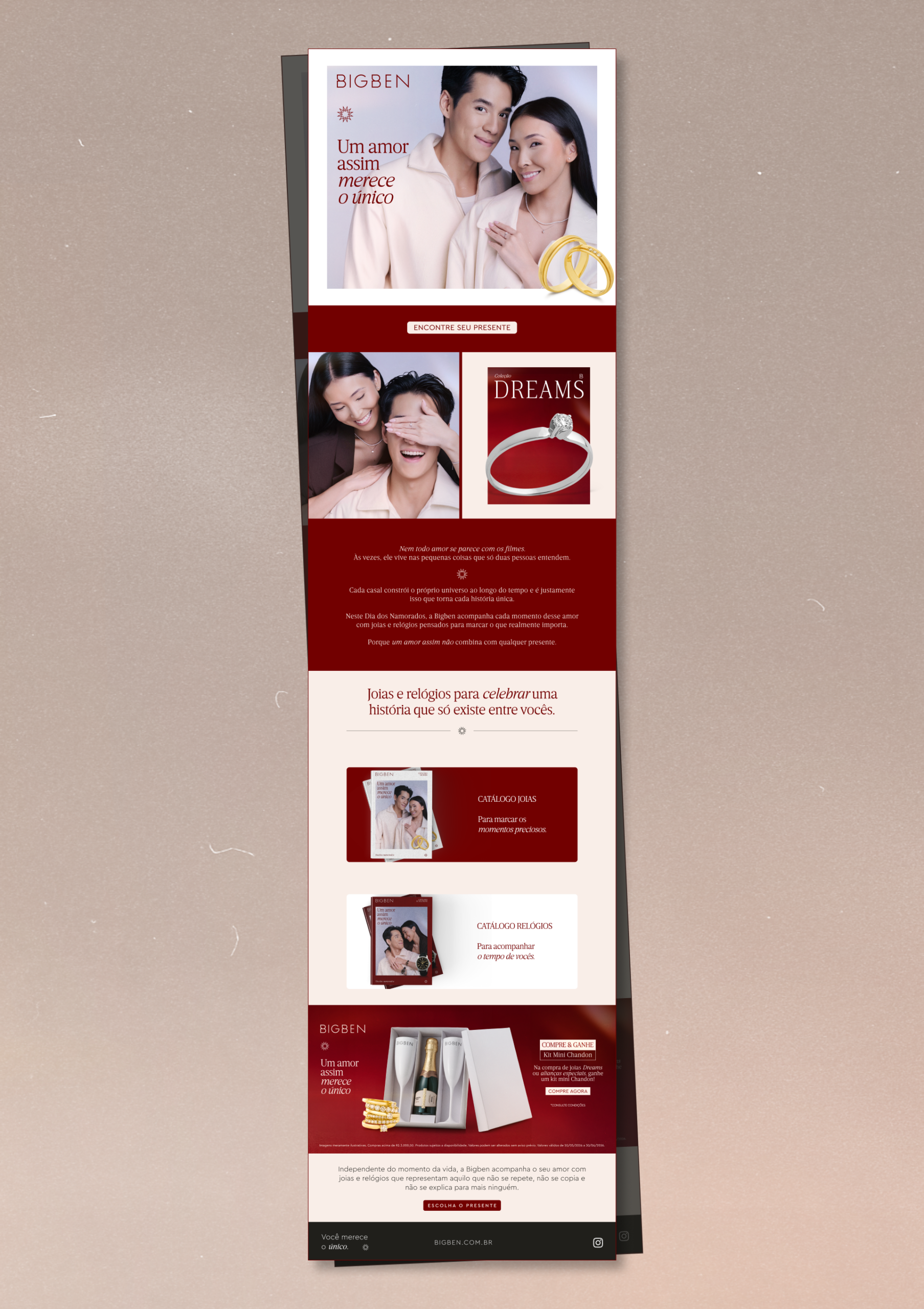
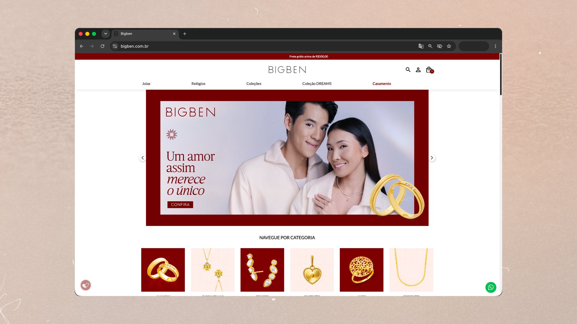
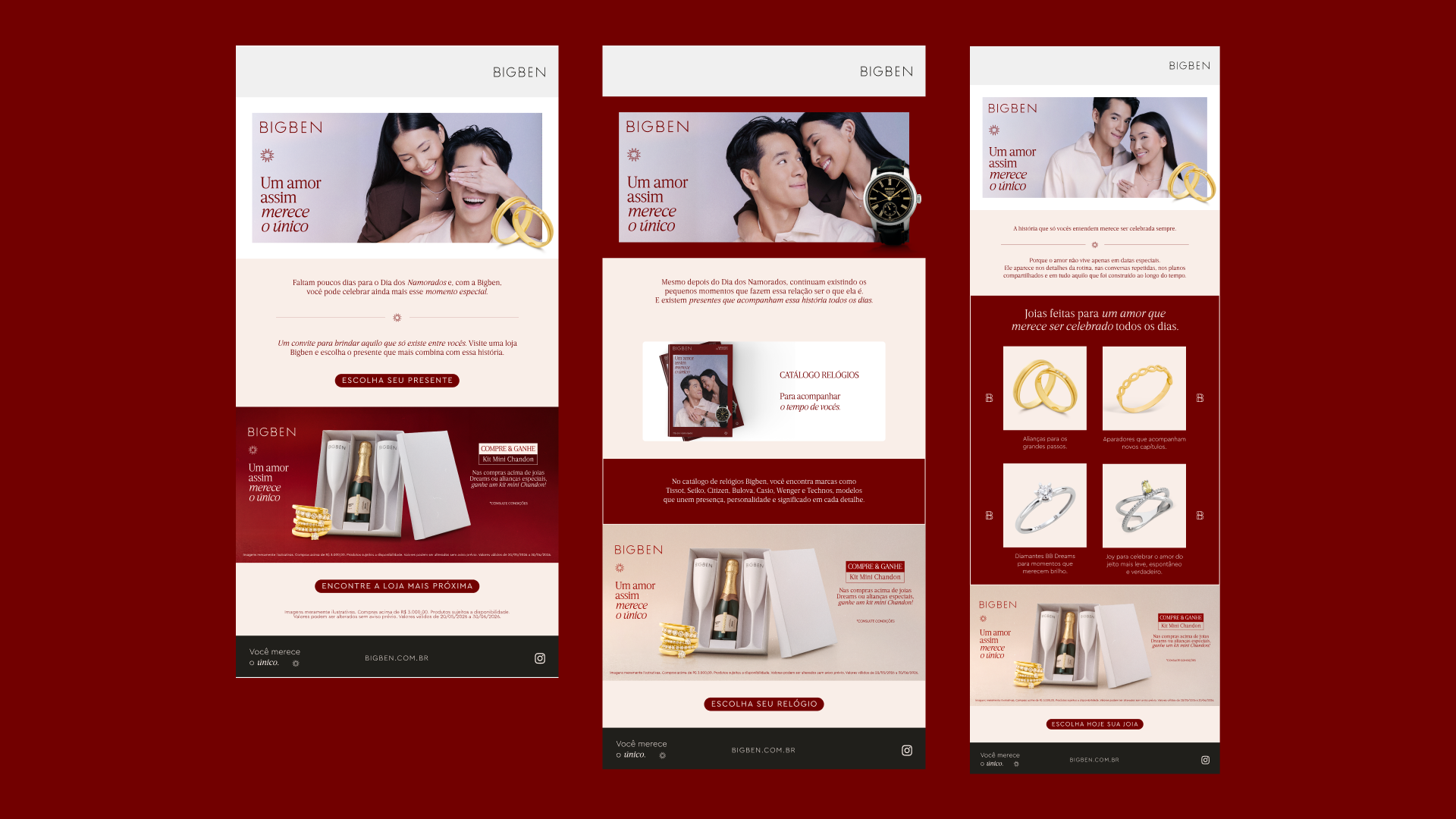
The project’s greatest technical strength lies in its systemic thinking and native infusion of movement. This wasn’t a print campaign forcibly adapted for screens. Each layout was designed anticipating the timing, cropping, and rhythm of animation for digital POS panels and paid media. This cross-platform consistency ensured that the brand experience remained identical, whether in the three-dimensional impact of a window sticker, the scrolling of a carousel on Meta, or the clean navigation of the landing page.
The practical result eliminated the common friction between creative team and client: the campaign was 100% approved on the first presentation, without requests for changes or course corrections. More than methodological excellence, the design proved its effectiveness as a financial asset, culminating in record-breaking sales within Bigben’s e-commerce platform. The case demonstrates that technical rigor combined with a strong anthropological narrative not only protects brand value but also dictates the pace of commercial growth.
Project created in 2026 at Annexo.
Approval: Suelyn Rodrigues Strategy: Juliano Ughini Content: Manoela Mendes Creative Concept and Art Direction: Guilherme Casasanto
All content rights are owned by Bigben and Annexo Todos os direitos de conteúdo são de propriedade da Bigben e Annexo.